Nothing OS 3.0 based on Android 15 is rolling out soon, and we got our hands on a beta version courtesy of Nothing. Here's everything that's new.


Nothing is gearing up to launch the next major version of its Android-based operating system called Nothing OS. Nothing OS 3.0 is coming soon, and it's based on Google's Android 15 release.
Ahead of the release of Nothing OS 3.0, Nothing offered us an early look at its new OS. We installed the beta version on our Nothing Phone (2a) review unit to see what's new, and there's quite a lot that's changed. Here's everything we found so far.
One of the first things you'll notice about Nothing OS 3.0 is its revamped UI for notifications and Quick Settings.
Gone is the always-dark, AOSP-like design and in its place is a new design that still feels stock-like but has a bit of Nothing's personal flair to it. The new notifications and Quick Settings redesign in Nothing OS 3.0 thankfully doesn't split the two into separate pages like Android 16 and One UI 7 are poised to do, but it does reduce the number of Quick Settings tiles you can see in the initial dropdown, at least at first glance. That's because the Quick Settings tiles in Nothing OS 3.0 are now resizable, so it's possible to fit 8 tiles in the initial dropdown.
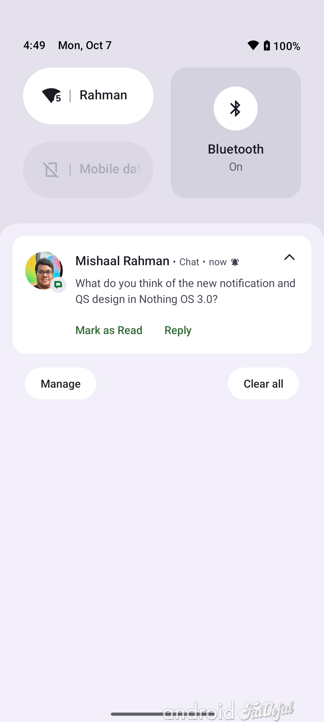
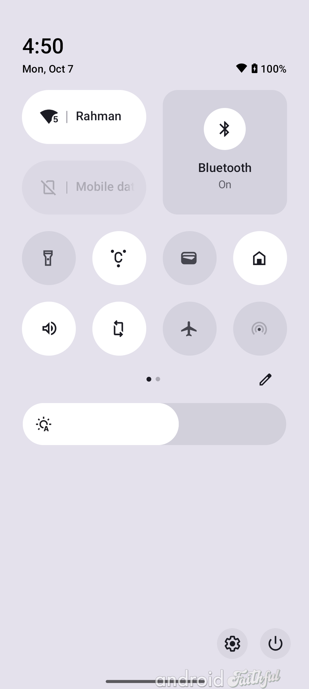
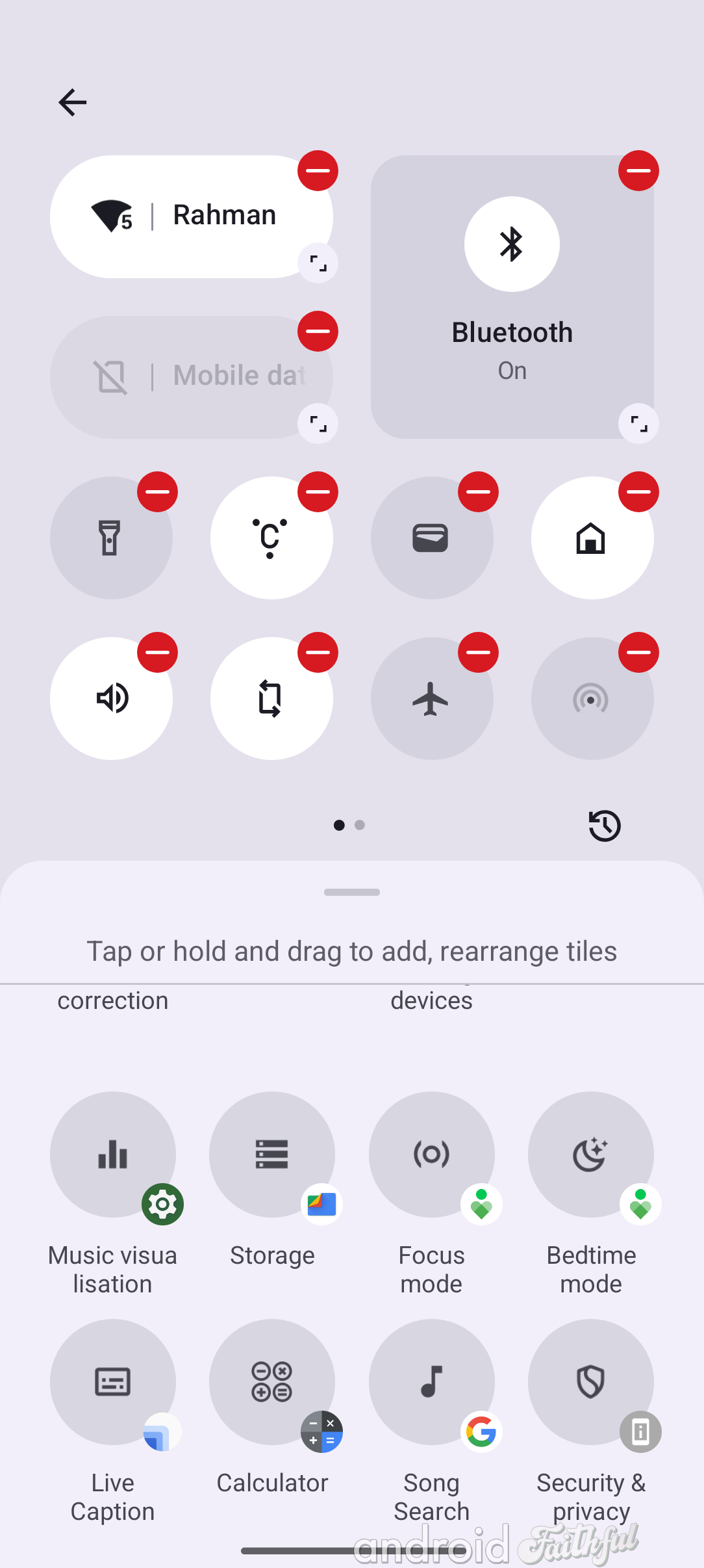
The new notifications and Quick Settings layouts in Nothing OS 3.0.
While most of the Quick Settings tiles don't have any special properties when expanded to their 2x1 sizes, some, like the ringer tile, have additional states. The ringer tile, when fully expanded, lets you switch between silent mode, vibrate mode, and ringer mode. The Bluetooth tile, meanwhile, is the only one that can be expanded to a 2x2 size. The rest of the tiles mostly behave as before, including the redesigned Internet tile which still opens up into the Internet panel.
There are three things in particular that I find really neat about the new notifications and Quick Settings design in Nothing OS 3.0. First, the new brightness slider lets you toggle adaptive brightness by tapping the icon on the very left of the bar. (It's also thicker and placed below the Quick Settings tiles, if that wasn't obvious.) Second, the Quick Settings editor lets you see what app contributed a particular tile, which I found to be a nice touch. (The editor also makes it easier to add or remove tiles; instead of dragging and dropping, you just tap a tile now.) Third, Nothing brought back the mobile data tile, which I think some folks will really like.
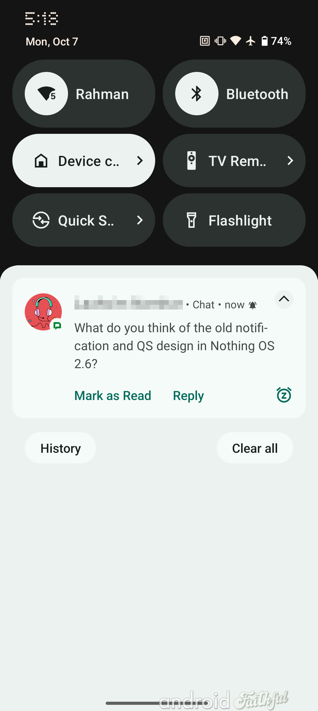
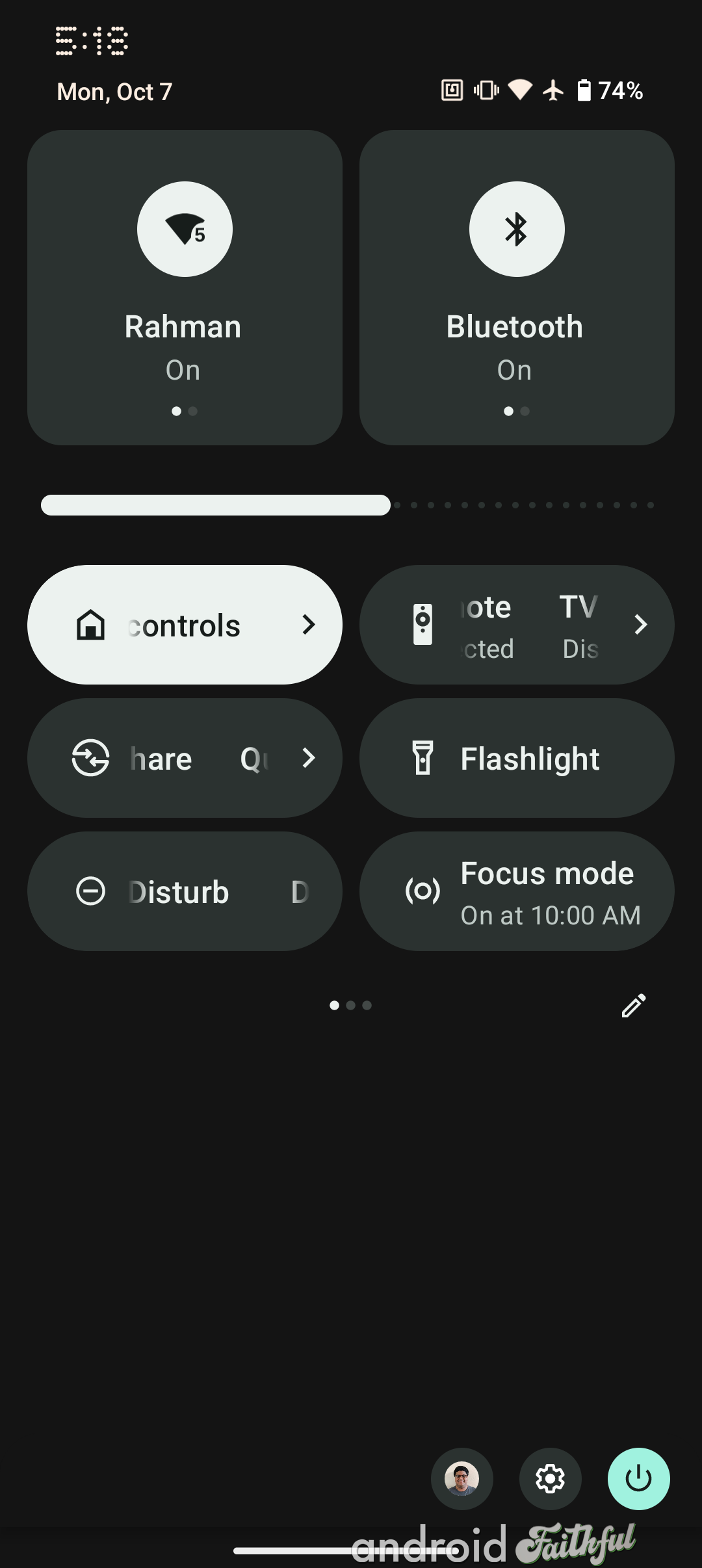
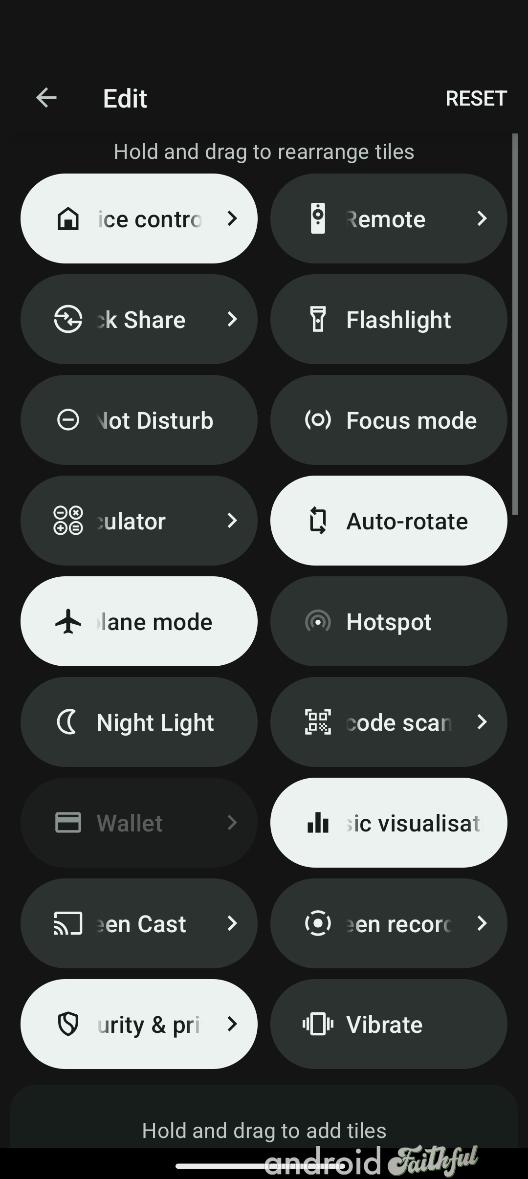
The old notifications and Quick Settings layouts in Nothing OS 2.6.
Nothing has followed Google by reorganizing the top-level page in Settings to be more organized. As you can see below, the top-level settings page now organizes entries into visually distinct sections. The Settings app in Nothing OS 3.0 isn't following the exact same structure as in Google's Android 15 release, but its pretty similar. From top to bottom, you have:
1) Network & Internet
2) Connected devices
---
3) Glyph interface
4) Lock screen
5) Customization
---
6) Apps
7) Notifications
8) Storage
9) Battery
10) Sound & vibration
11) Display
---
12) Security & privacy
13) Location
14) Passwords, passkeys & accounts
15) Safety & emergency
16) Accessibility
17) Digital Wellbeing & parental controls
18) Google
---
19) System
20) Special features
21) Tips & Feedback
22) About phone
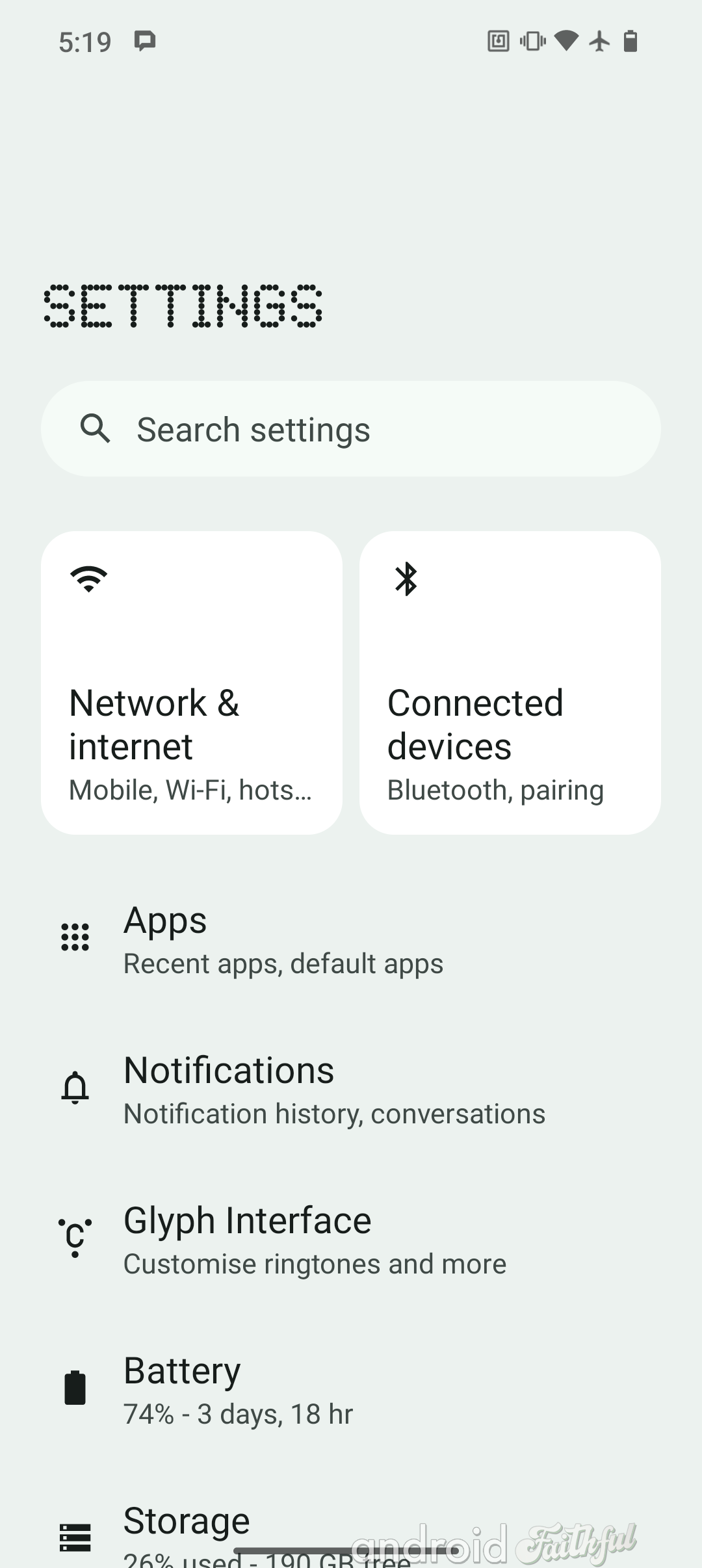
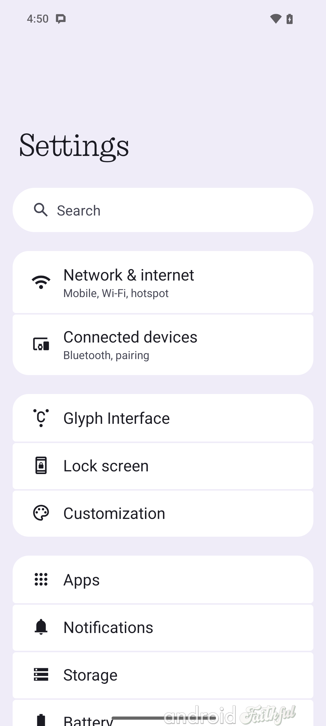
Left: Top-level settings page in Nothing OS 2.6. Right: Top-level settings page in Nothing OS 3.0.
Nothing has rearranged and added a few entries to the Settings app in Nothing OS 3.0. "Special features" is a new page that houses the "Experimental features" menu that was previously its own top-level settings item; it also holds the menus for "Gestures," "RAM Booster," "Pop-up view," and "Game Mode" that were previously under Settings > System.
Next, there's the new Tips & Feedback entry that opens up into the new Tips & Feedback app in Nothing OS 3.0. This app teaches you about the various features in Nothing OS 3.0, much like the Pixel Tips app does on Pixel devices. Nothing OS 3.0 sprinkles various tips throughout the Settings app to help you find relevant features, too.
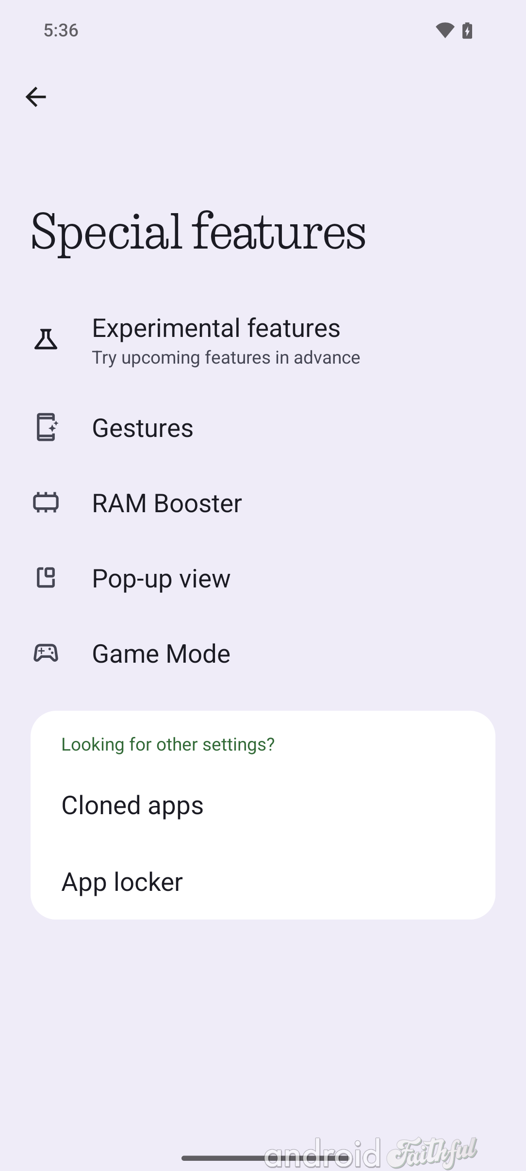
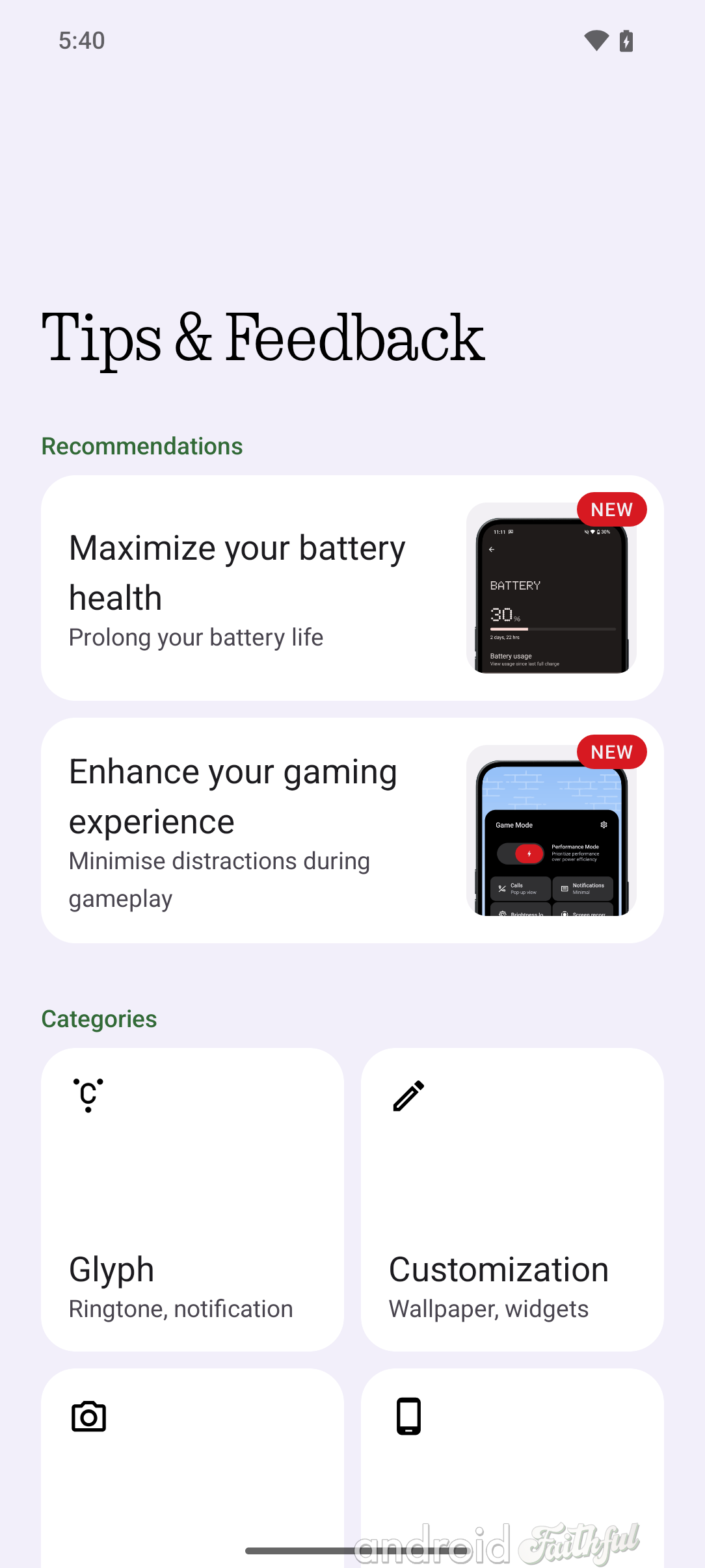
Notably, the Settings app no longer uses Nothing's NDot font for headers, which should make for better readability.
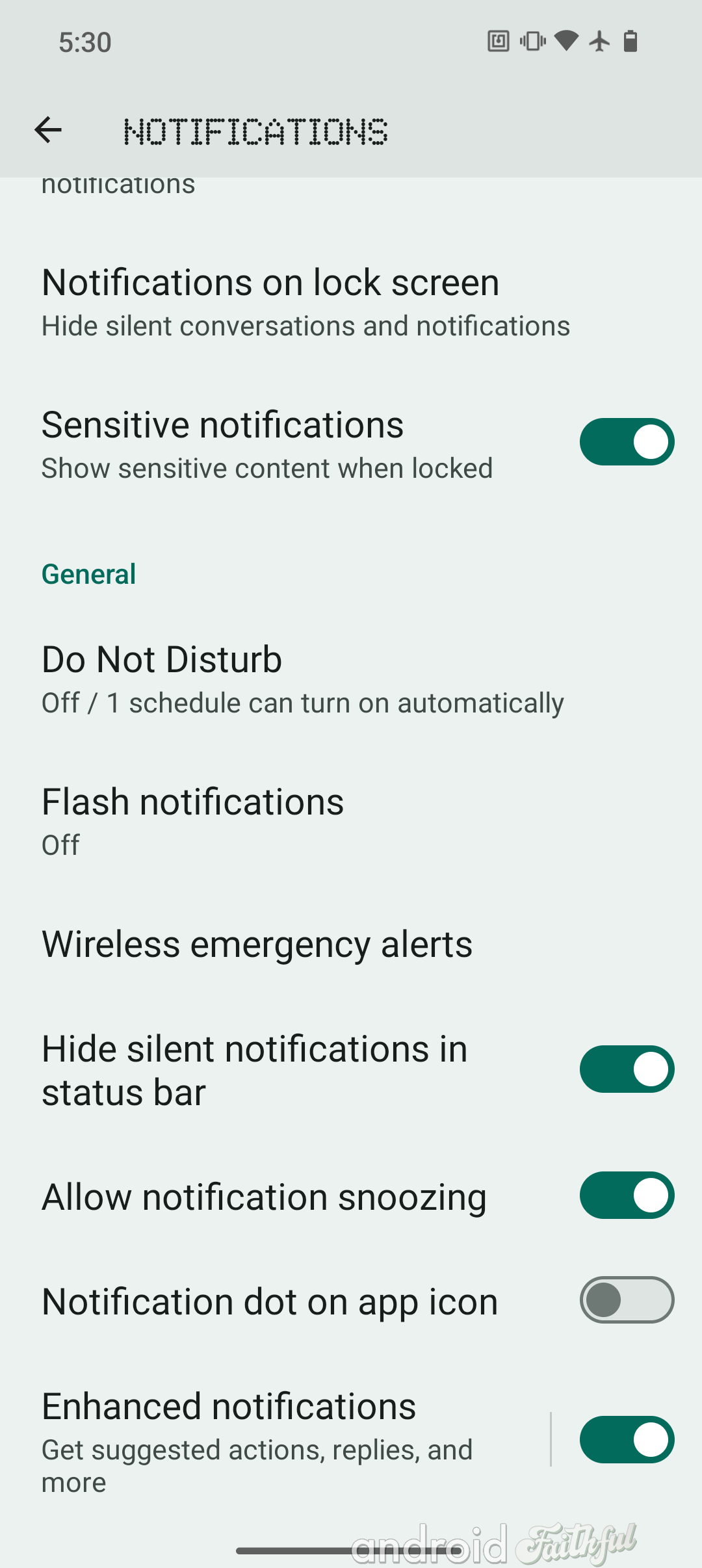
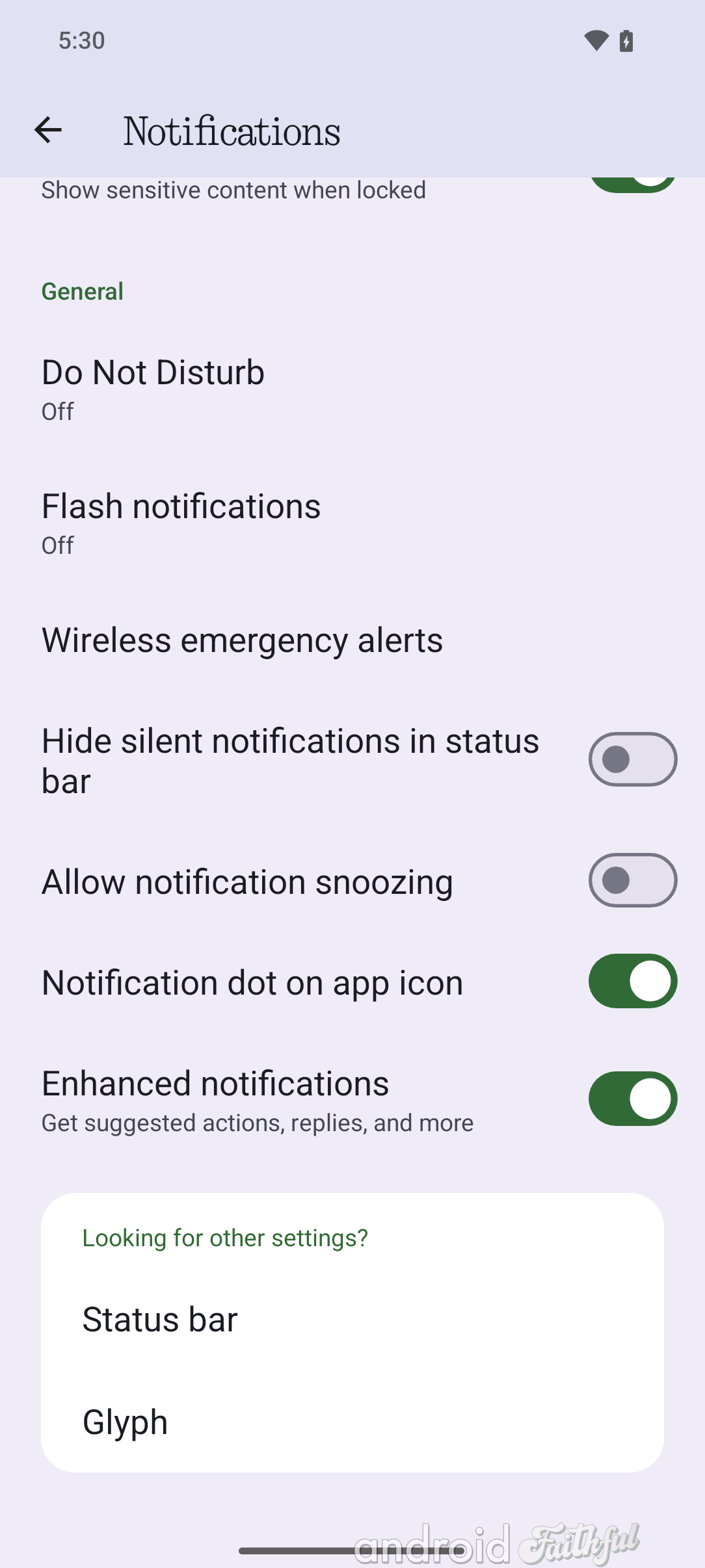
Left: Old Settings header used in Nothing OS 2.6. Right: New Settings header used in Nothing OS 3.0.
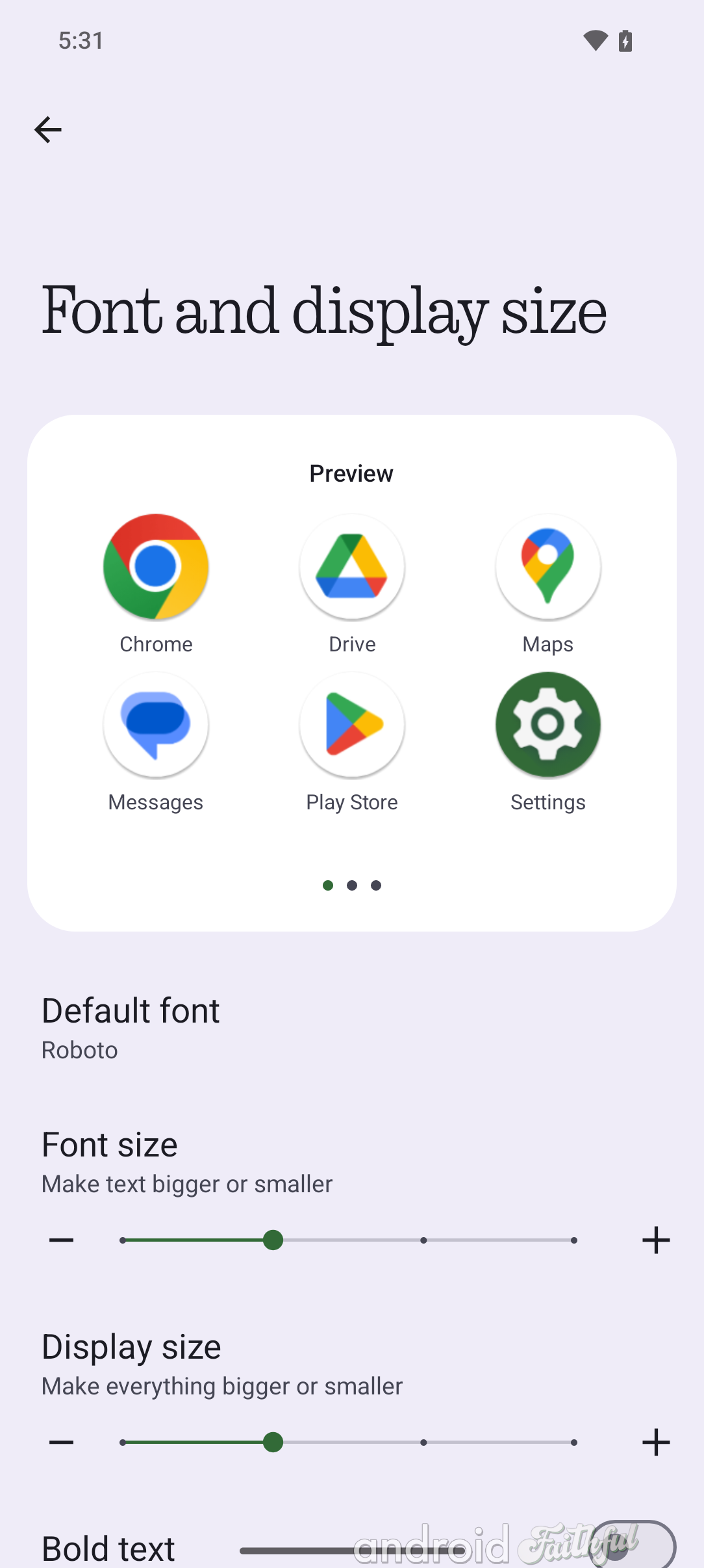
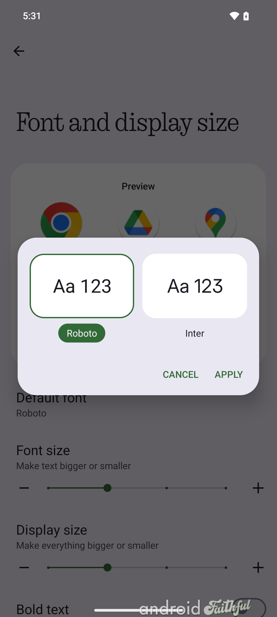
Speaking of fonts, it's also now possible to change the system font in Nothing OS 3.0 by going to Settings > Display > Font and display size (previously called Display size and text). You can pick between the default Roboto font and the Inter font.
Nothing has completely revamped the experience of customizing the lock screen in Nothing OS 3.0. The biggest changes include a more useful, dynamic preview of what the widgets or shortcuts you're adding will look like on the lock screen, more space for widgets, and new clock style options.
For comparison, here's what the UI for changing lock screen shortcuts looks like in Nothing OS 2.6 versus Nothing OS 3.0:
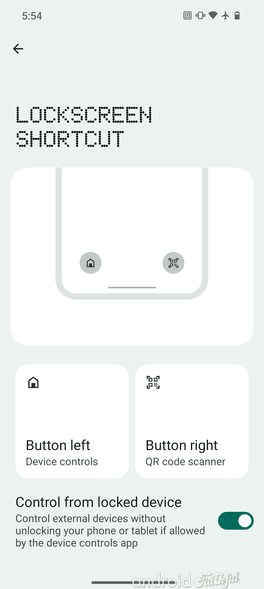
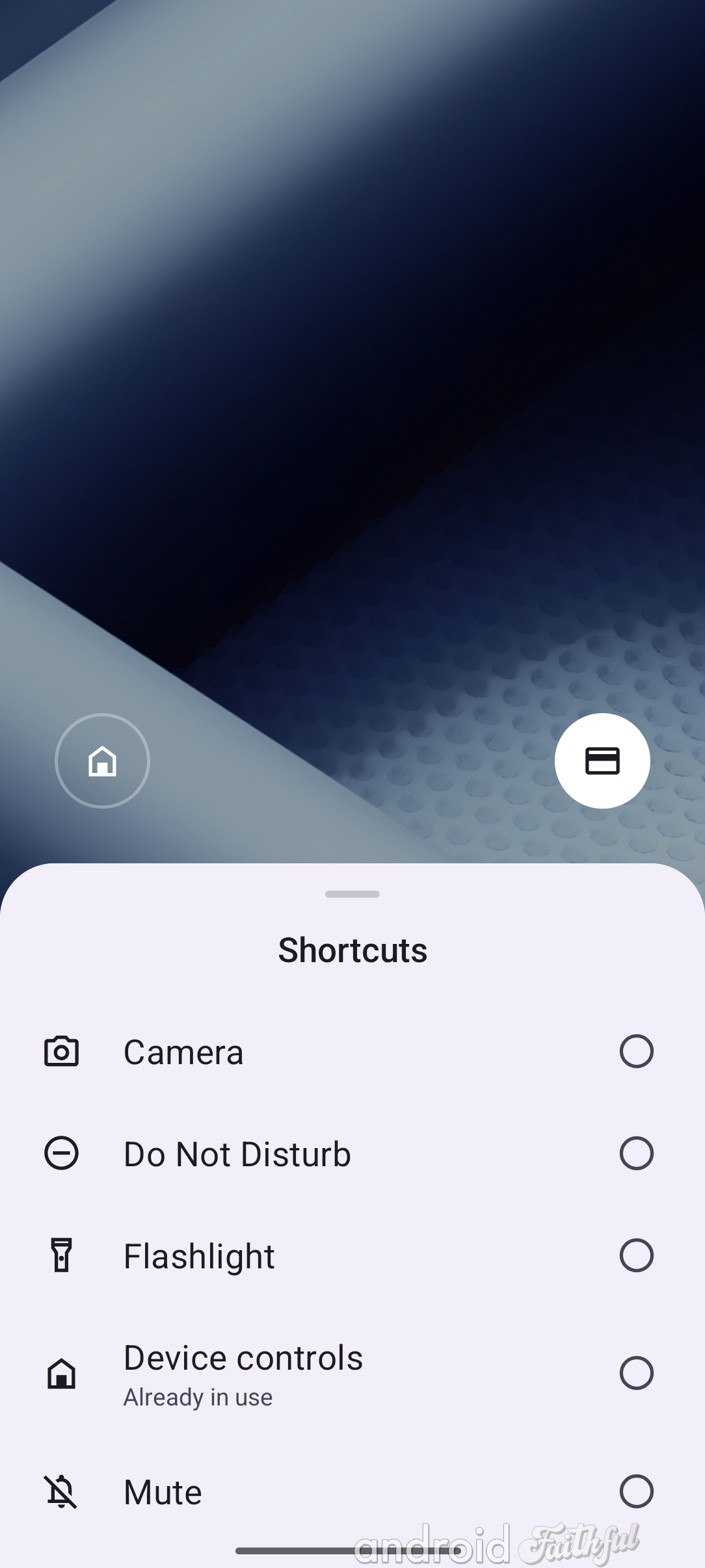
Left: Changing a lock screen shortcut in Nothing OS 2.6. Right: Changing a lock screen shortcut in Nothing OS 3.0.
And now, here's a gallery comparing the UI for changing lock screen shortcuts in Nothing OS 2.6 versus Nothing OS 3.0:
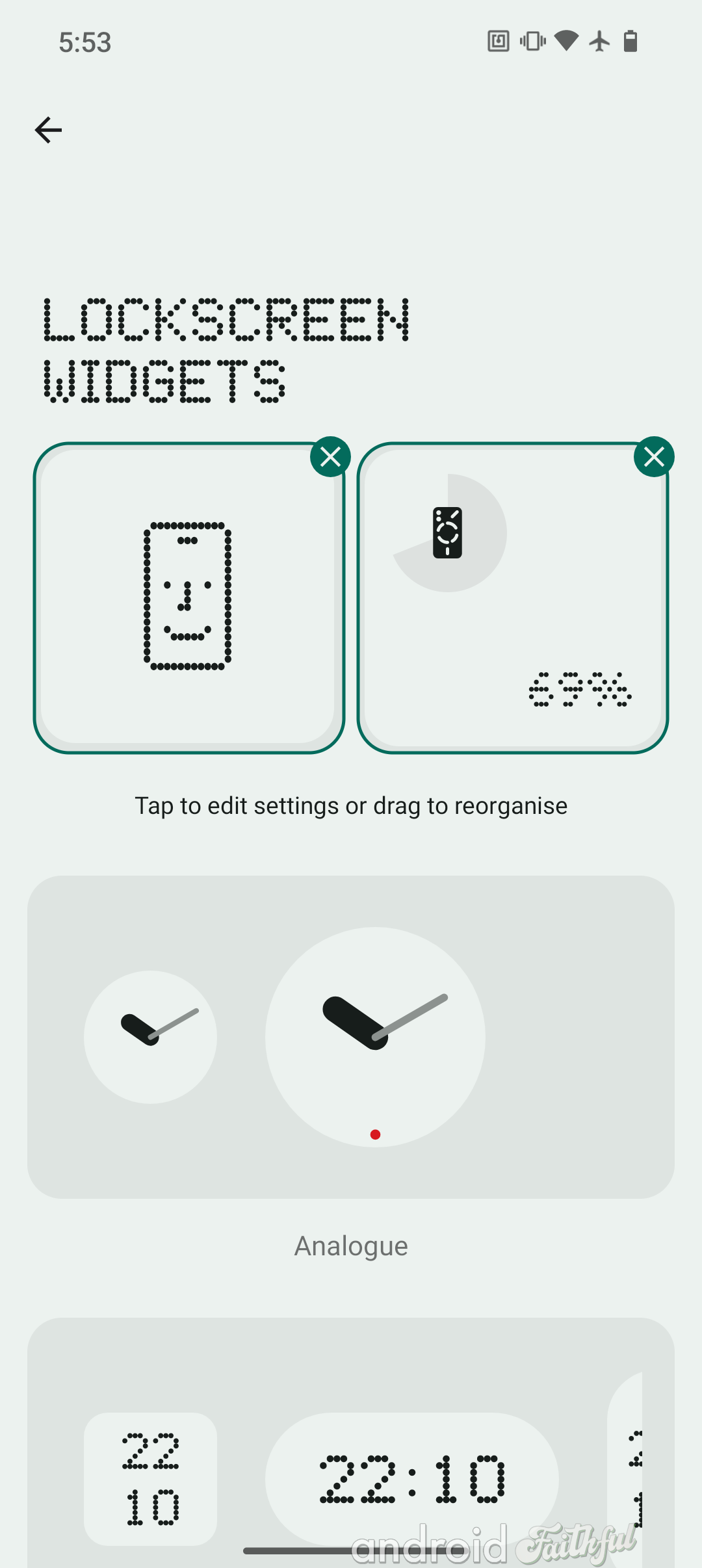
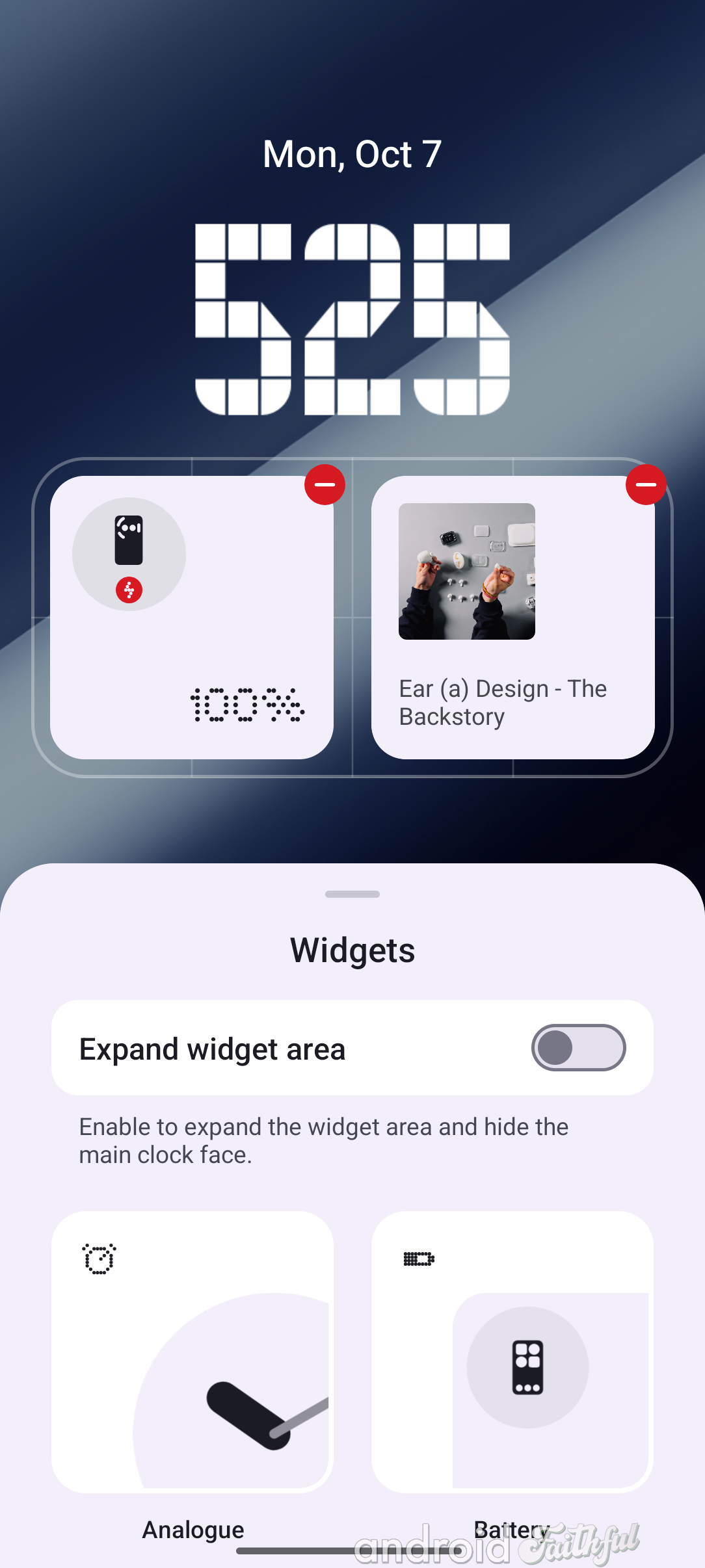

Left: UI for changing lock screen widgets in Nothing OS 2.6. Middle & right: UI for changing lock screen widgets in Nothing OS 3.0.
As you can see, Nothing OS 3.0 lets you directly preview what the lock screen will look like when you add or remove widgets. It also lets you expand the widget area to show more widgets, though this significantly reduces the size of the clock. The widget area by default is a 4x2 grid, but toggling the "expand widget area" button enlarges it to a 4x4 grid.
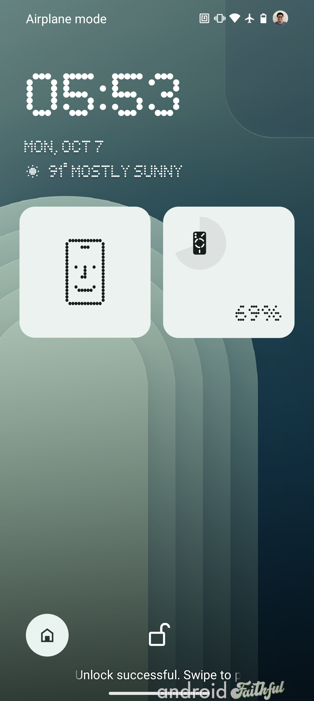
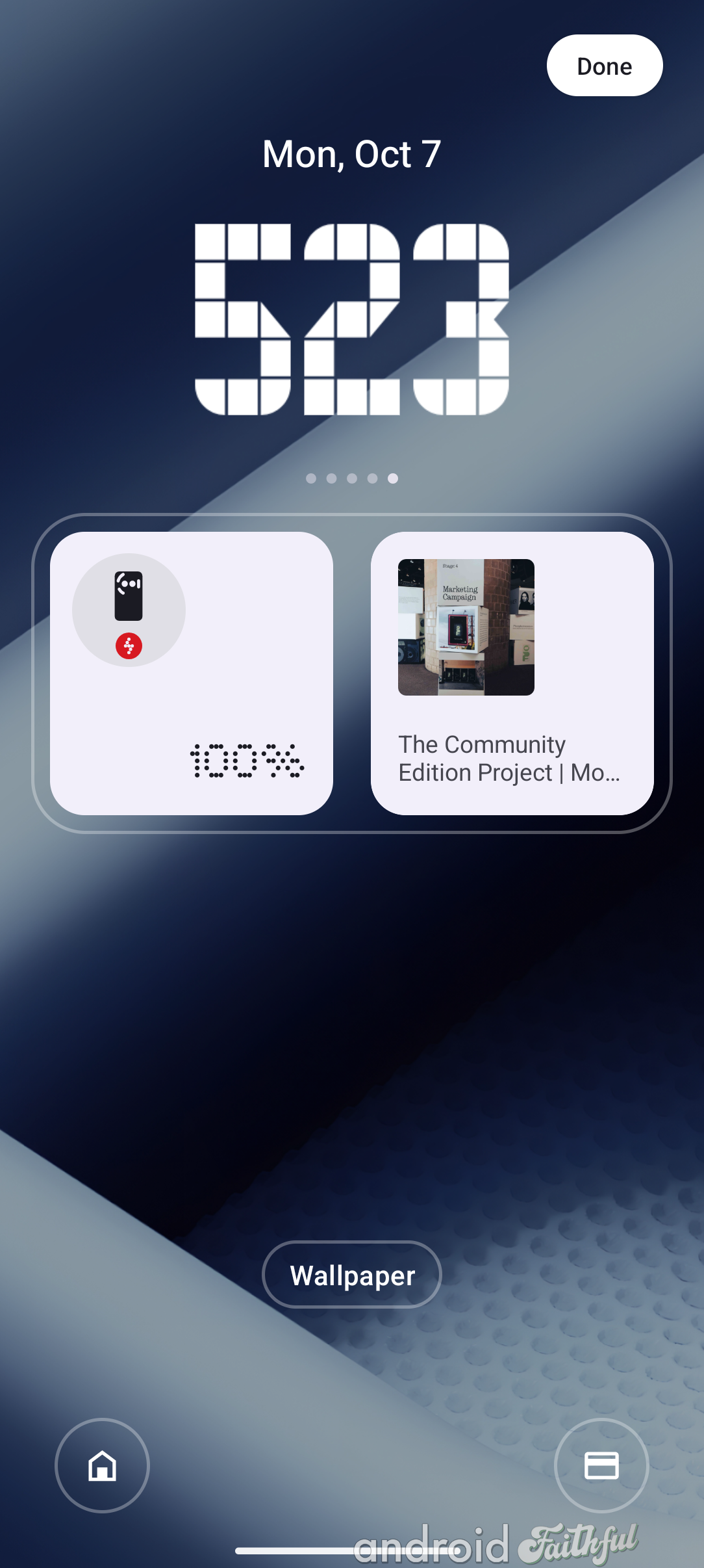
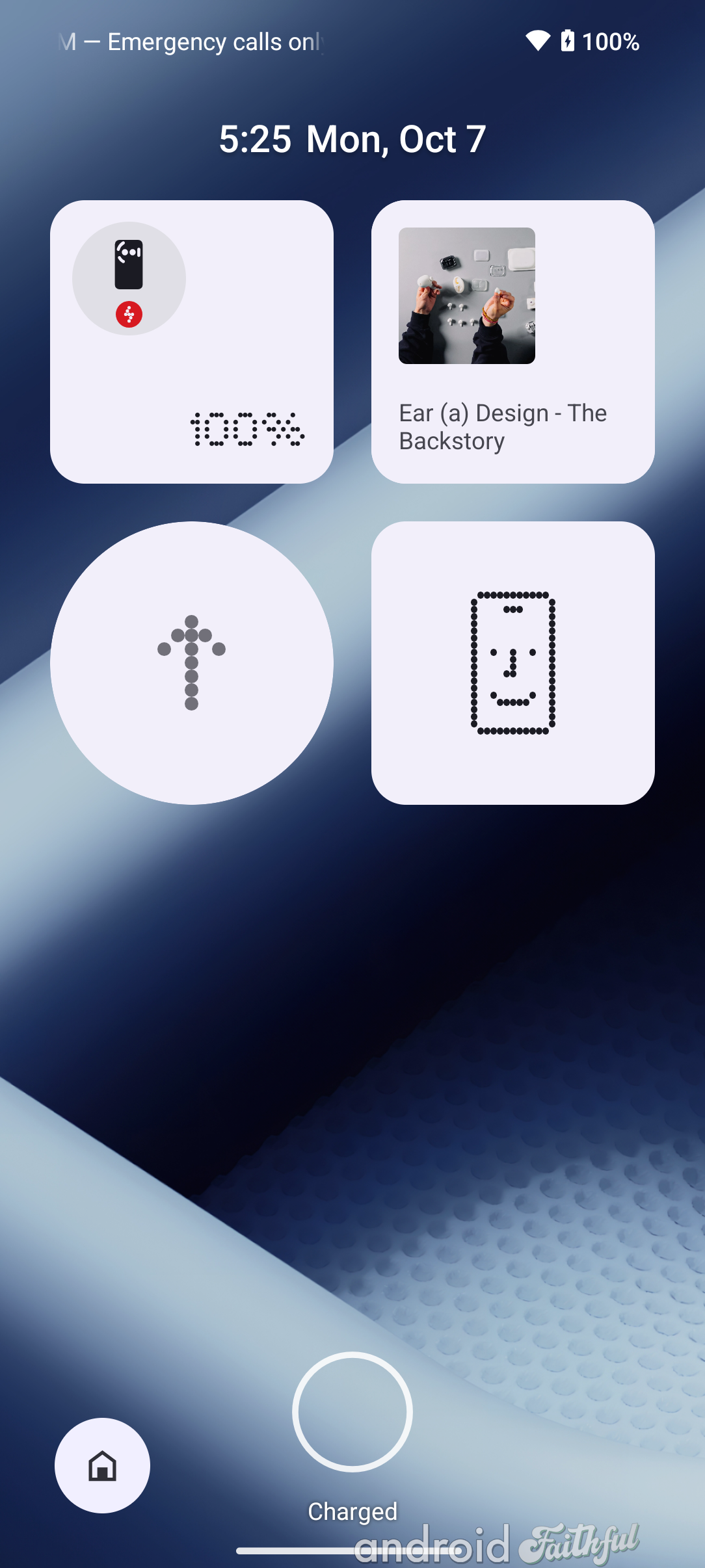
Left: Lock screen in Nothing OS 2.6 with two widgets. Middle: Lock screen (preview) in Nothing OS 3.0 with a 4x2 widget grid. Right: Lock screen in Nothing OS 3.0 with a 4x4 widget grid.
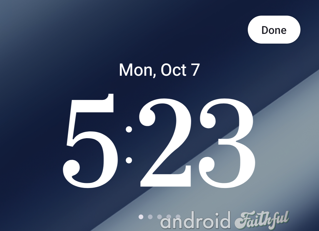
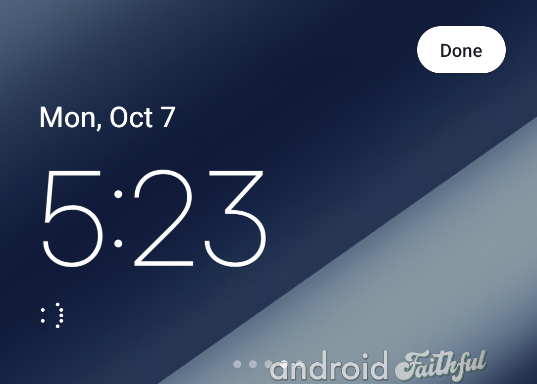
When you pull down the widget panel to see the fullscreen preview of the lock screen, you have the option to swipe left or right on the clock to change the clock style, but only if the "expand widget area" toggle is off. There are a total of 5 preinstalled clock styles, as shown below.
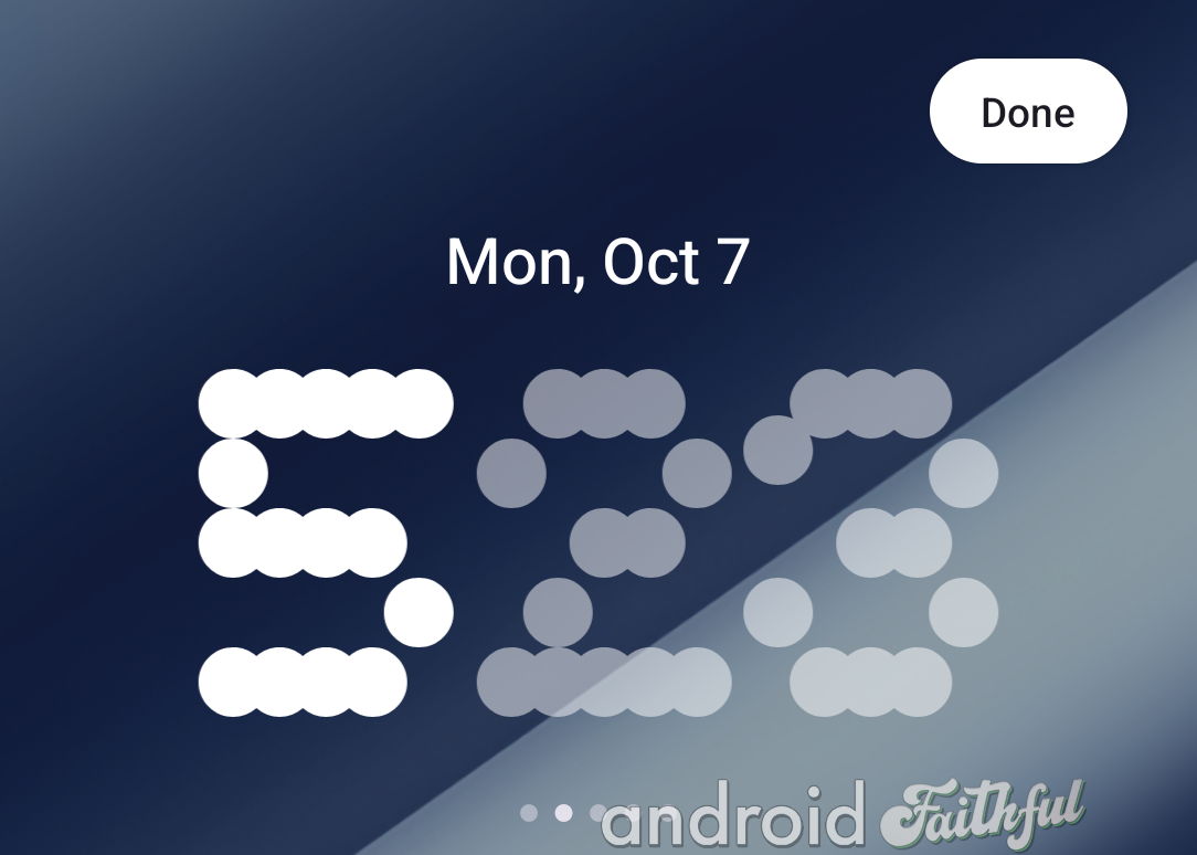
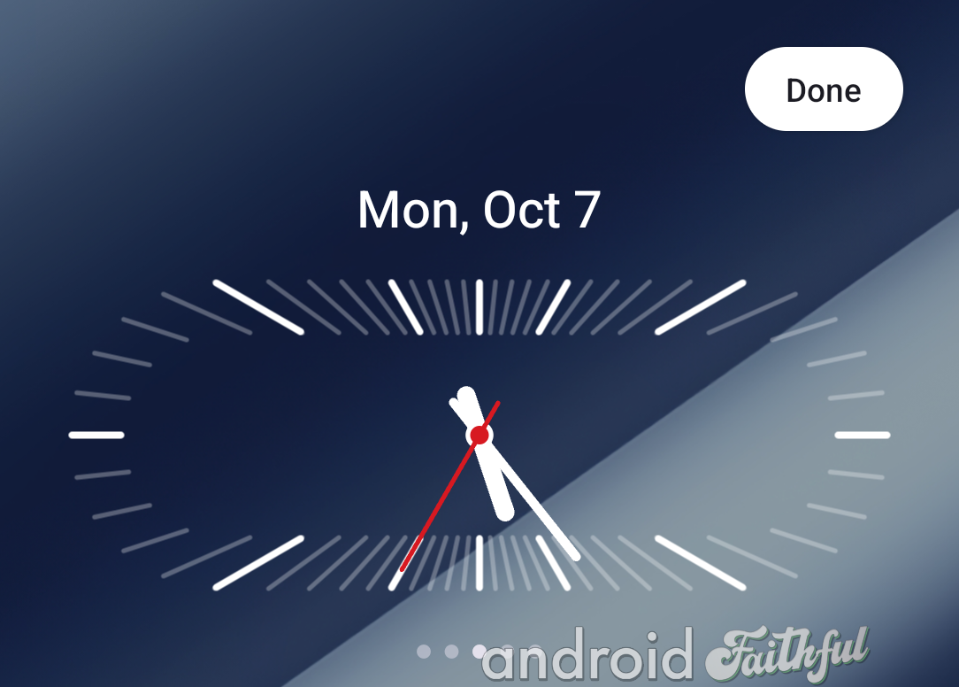
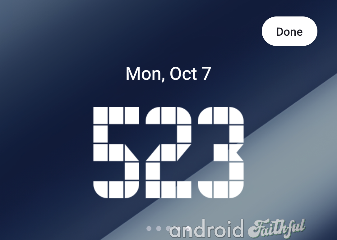
Nothing has updated the widget picker in Nothing OS 3.0 to include a dedicated page for its own widgets. The first page is dedicated to Nothing's widgets, while the second page shows widgets from all other apps. You simply need to swipe left or right to switch between the pages.
Previously, there was only a single page for the widget picker in Nothing OS 2.6. Nothing's widgets were placed at the very top, requiring you to scroll down to see regular Android widgets.
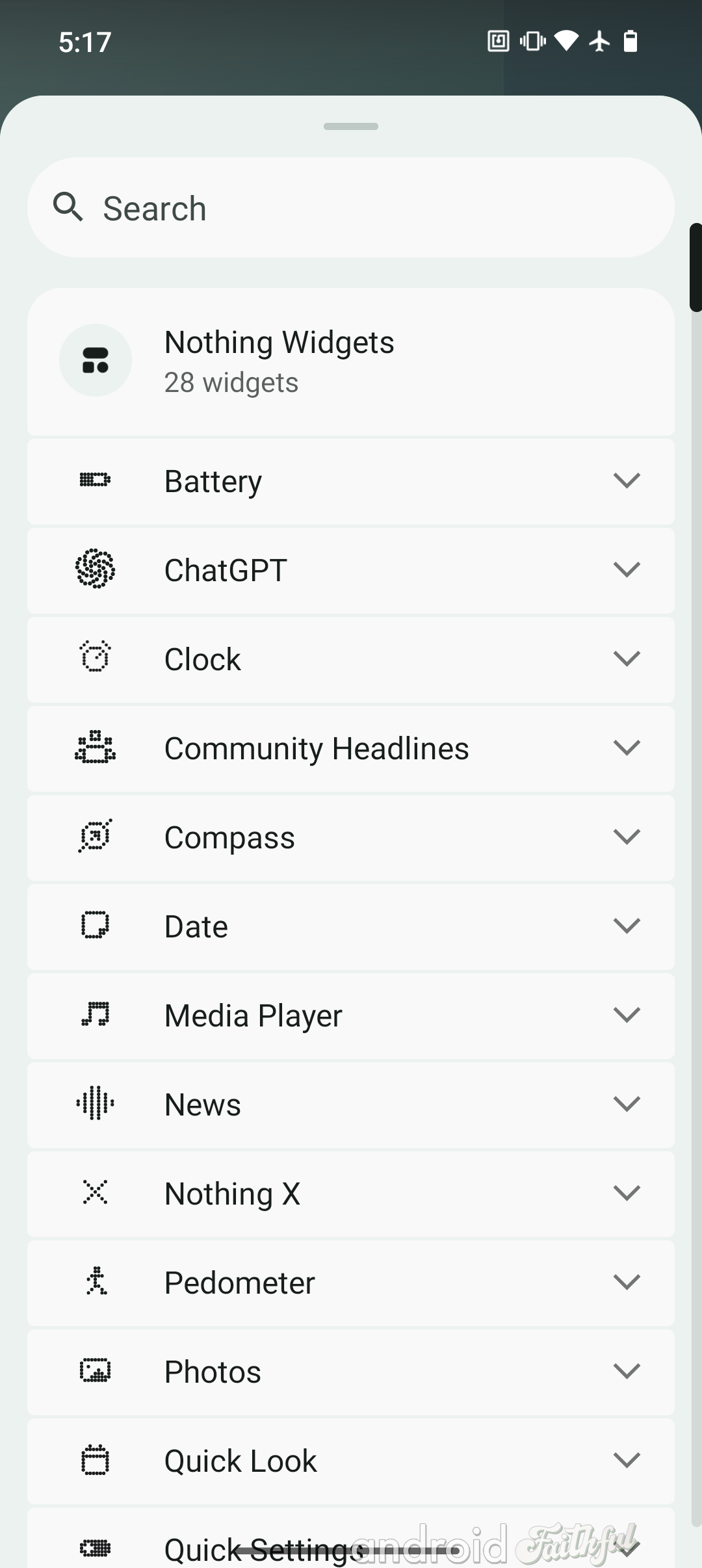
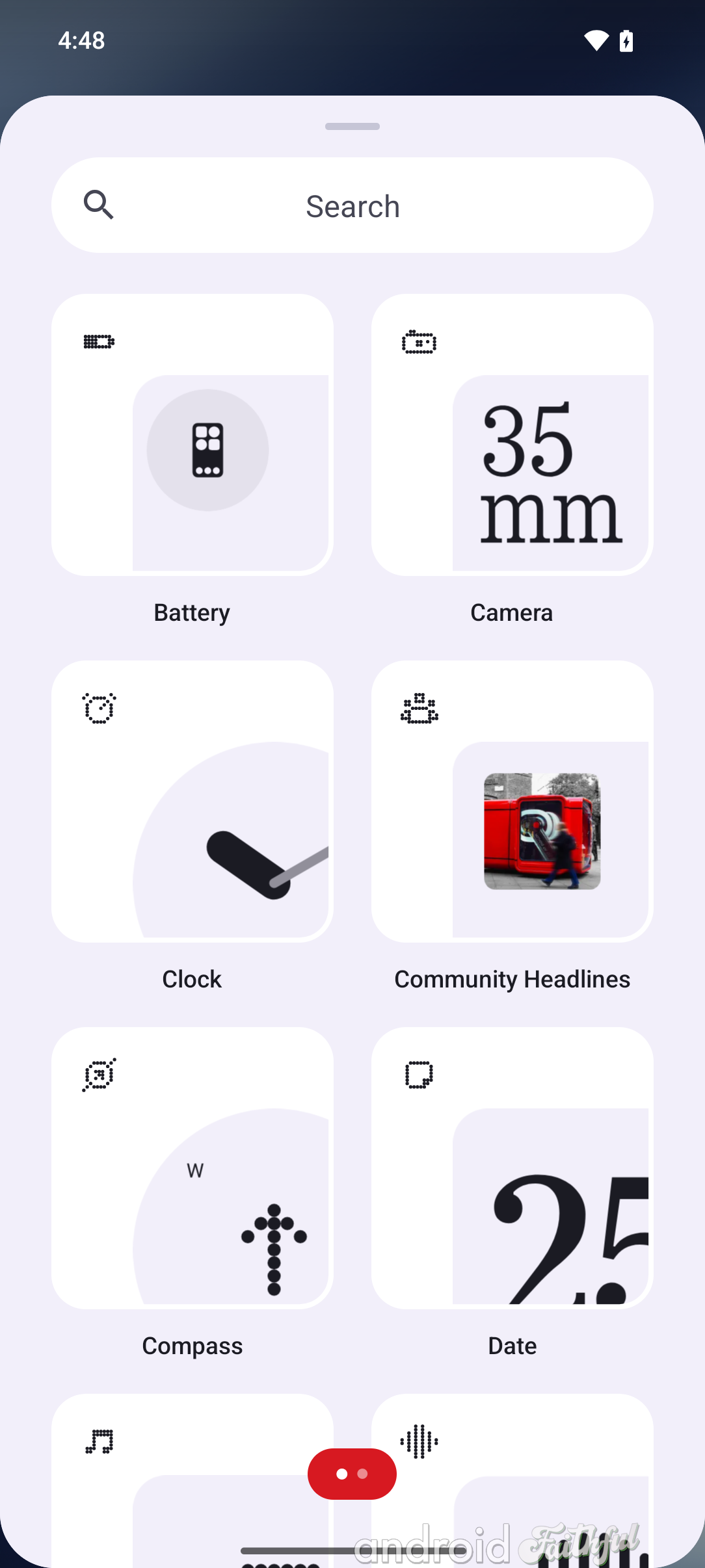
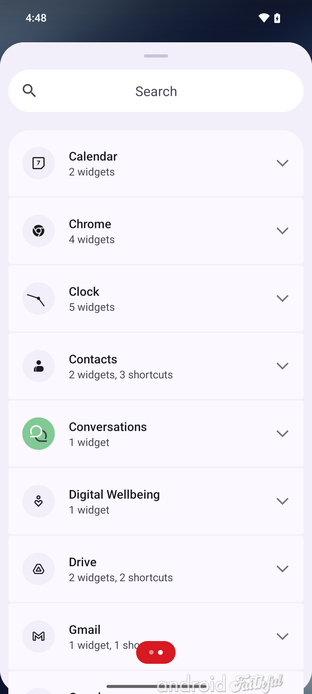
Left: Old widget picker UI in Nothing OS 2.6. Middle: Page 1 of the new widget picker UI in Nothing OS 3.0. Right: Page 2 of the new widget picker UI in Nothing OS 3.0.
Nothing is introducing a new "Smart App Drawer" feature in Nothing OS 3.0 that "leverage[s] the power of AI to support categorisation of your all [sic] apps." When you first open up the app drawer after updating to Nothing OS 3.0, you'll see a card at the top asking you to try the feature out. You can tap "try it now" to enable the Smart App Drawer or "maybe later" to dismiss the card. You can later switch between the default app drawer layout or the Smart App Drawer layout by tapping the three-dot menu in the search bar, which opens up the new App Drawer settings in Nothing OS 3.0.
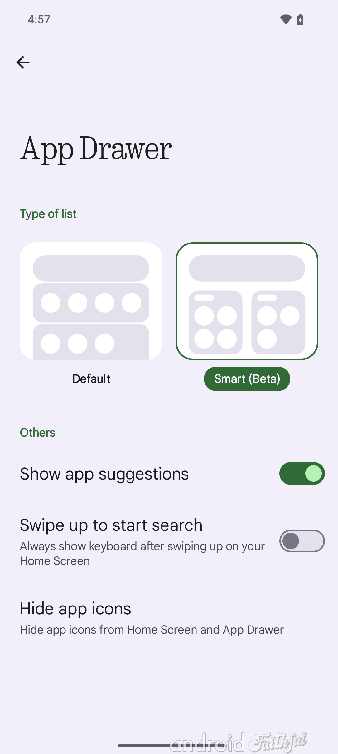
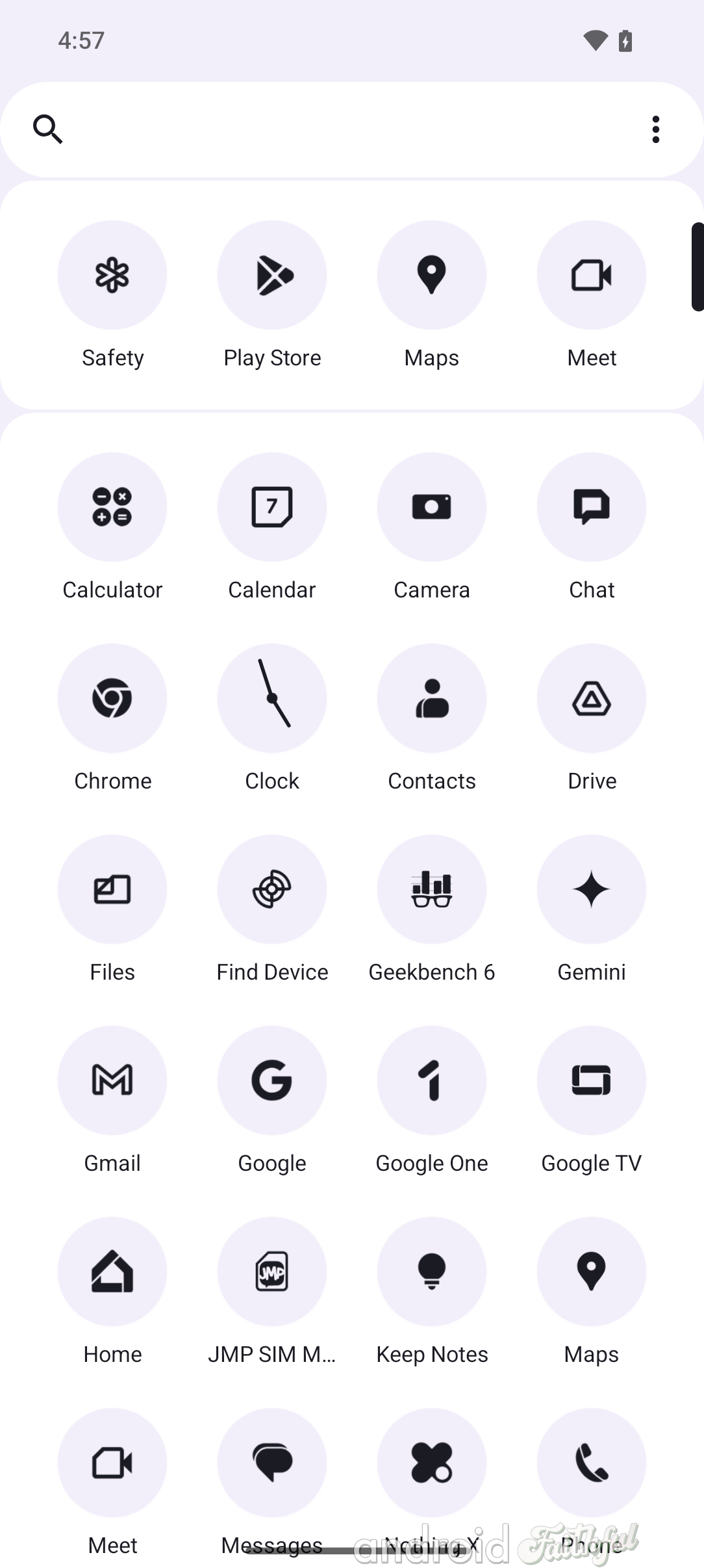
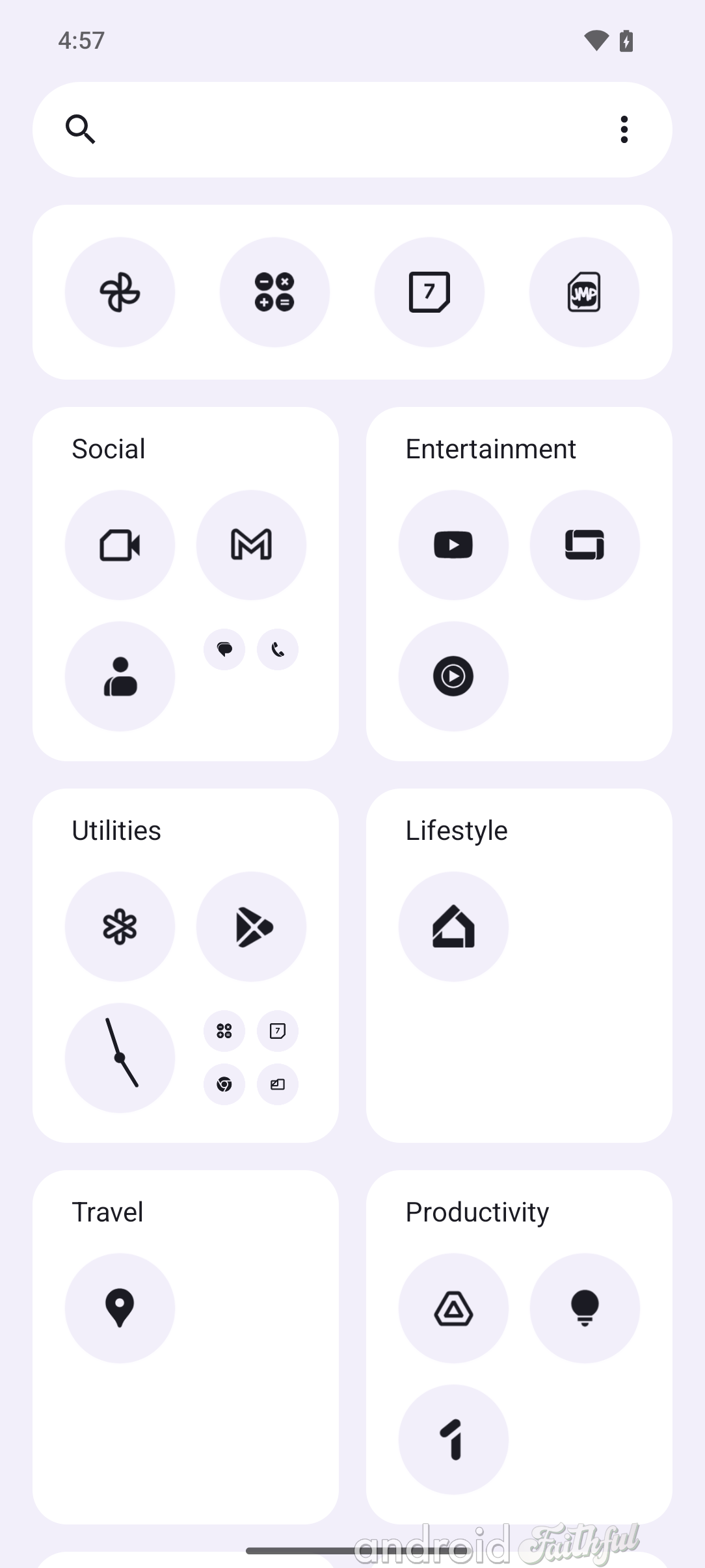
Left: App Drawer settings in Nothing OS 3.0. Middle: Default app drawer layout in Nothing OS 3.0. Right: Smart App Drawer layout in Nothing OS 3.0.
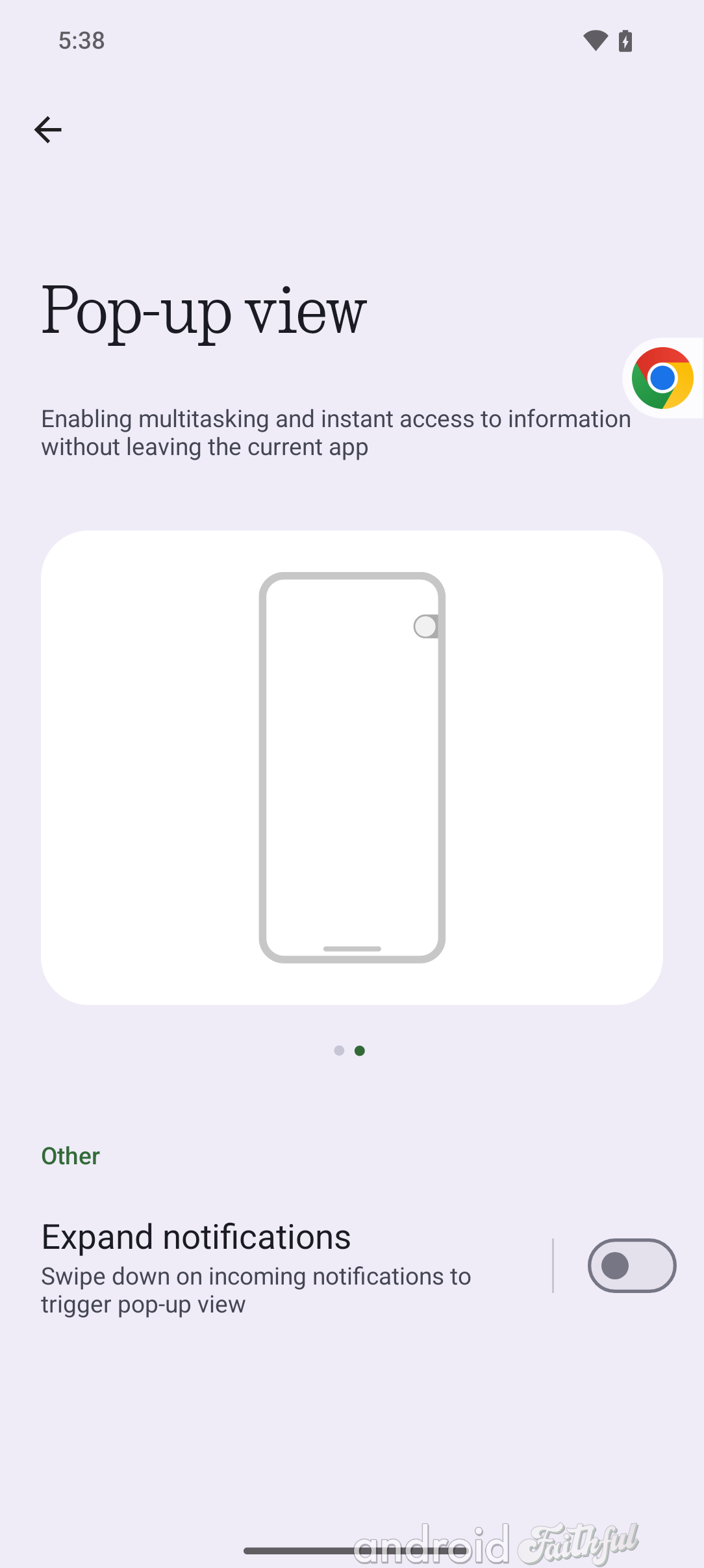
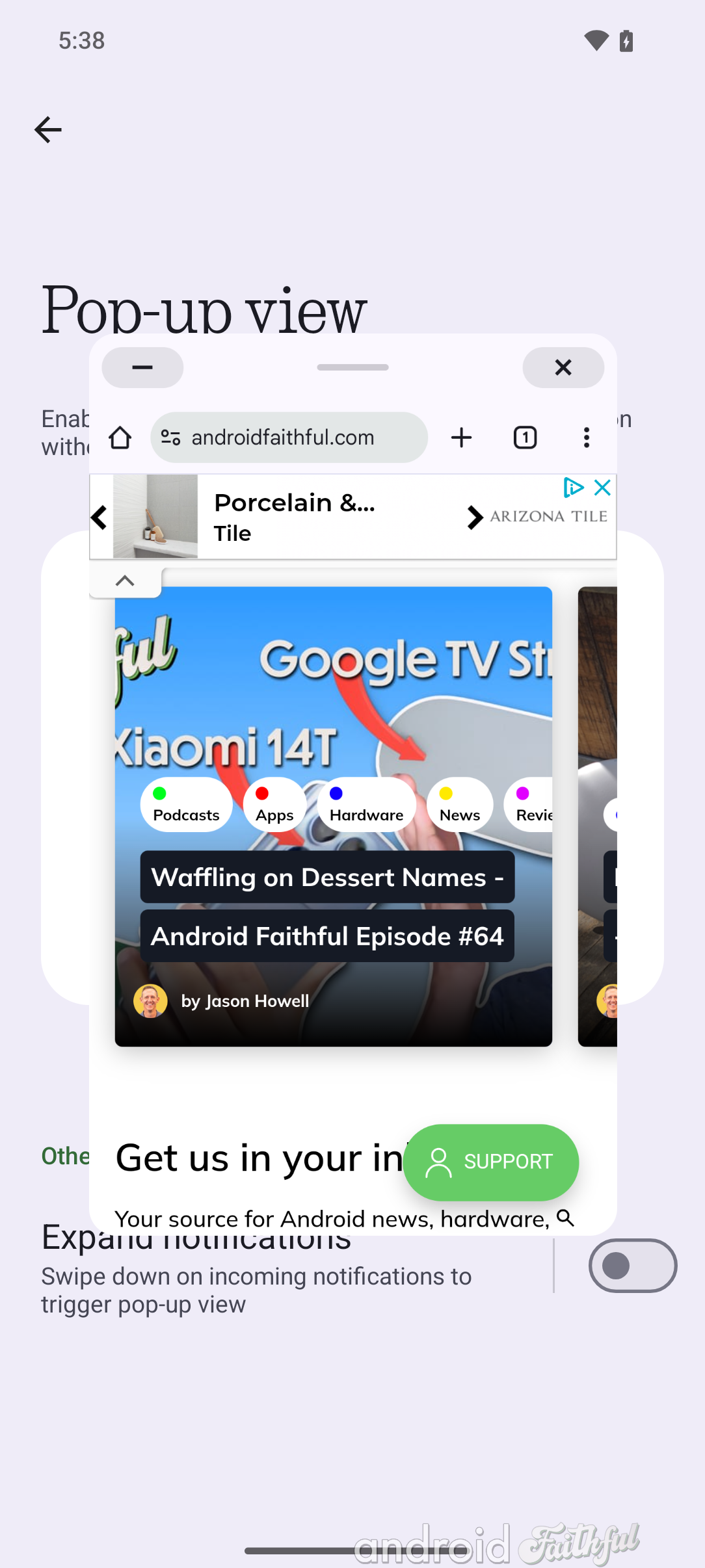
Nothing's pop-up view feature, which lets you open apps in a floating window, is getting a much-needed upgrade in Nothing OS 3.0. Instead of showing a confusing drag handle at the bottom, it now shows buttons at the top of the window much like on desktop operating systems. Furthermore, you can now minimize the window into a bubble that can sit on the side of the screen.
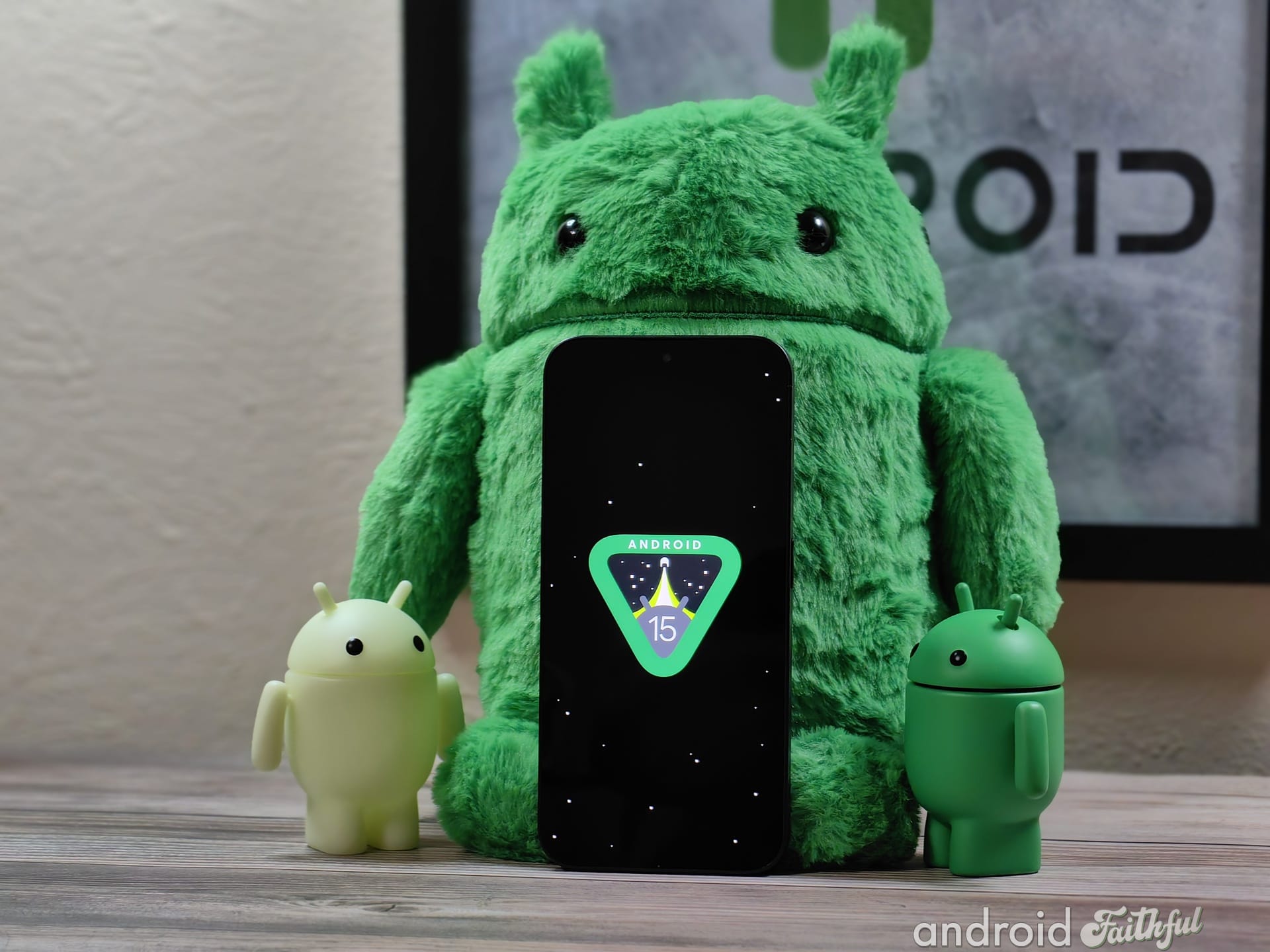
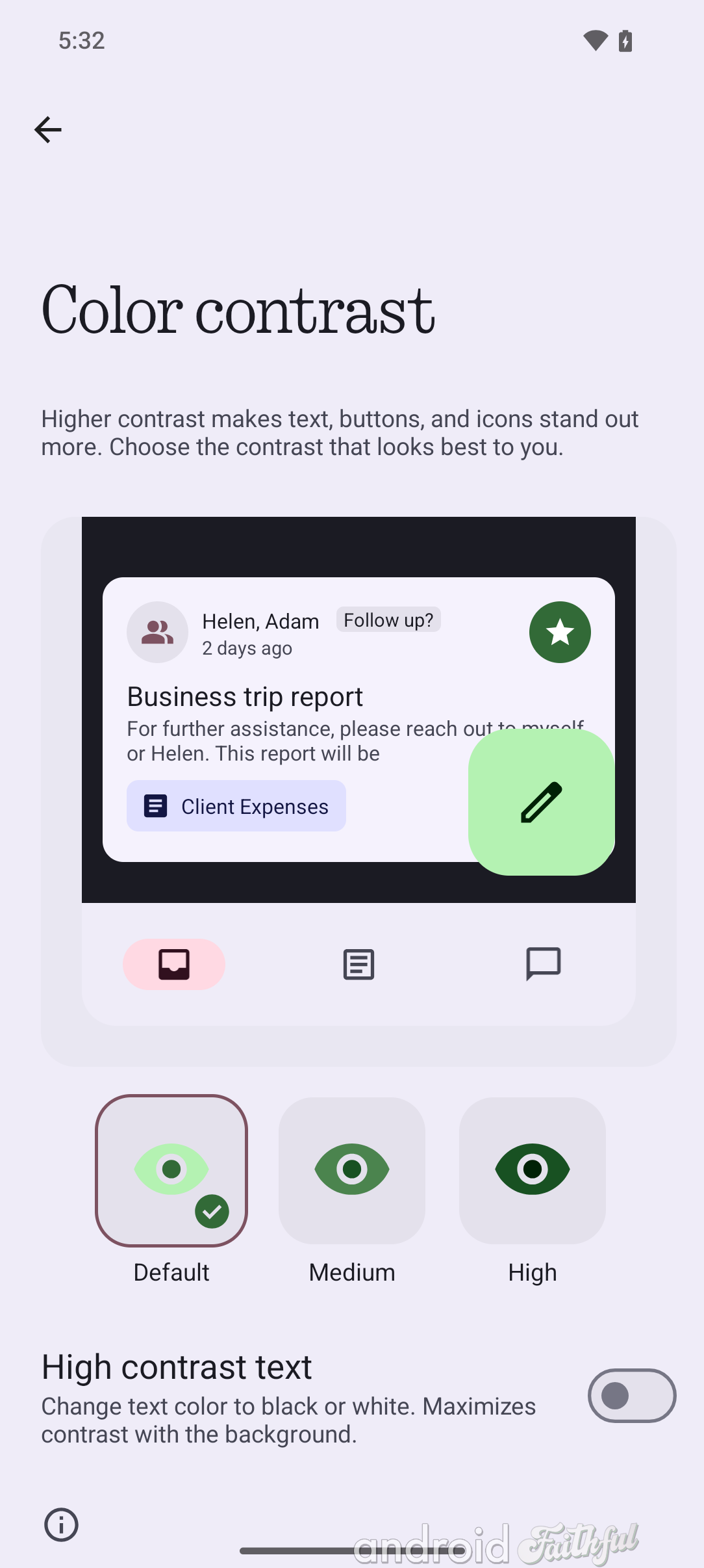
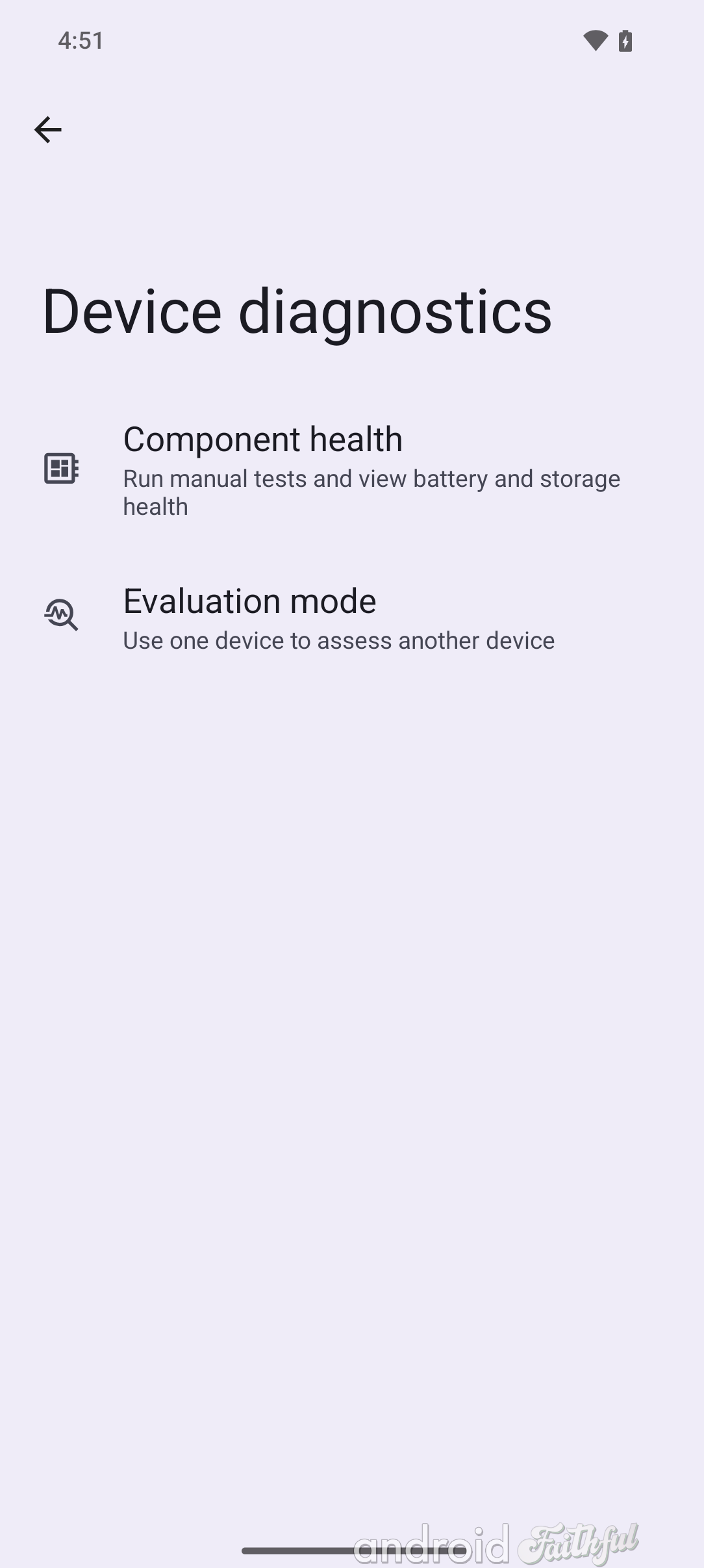
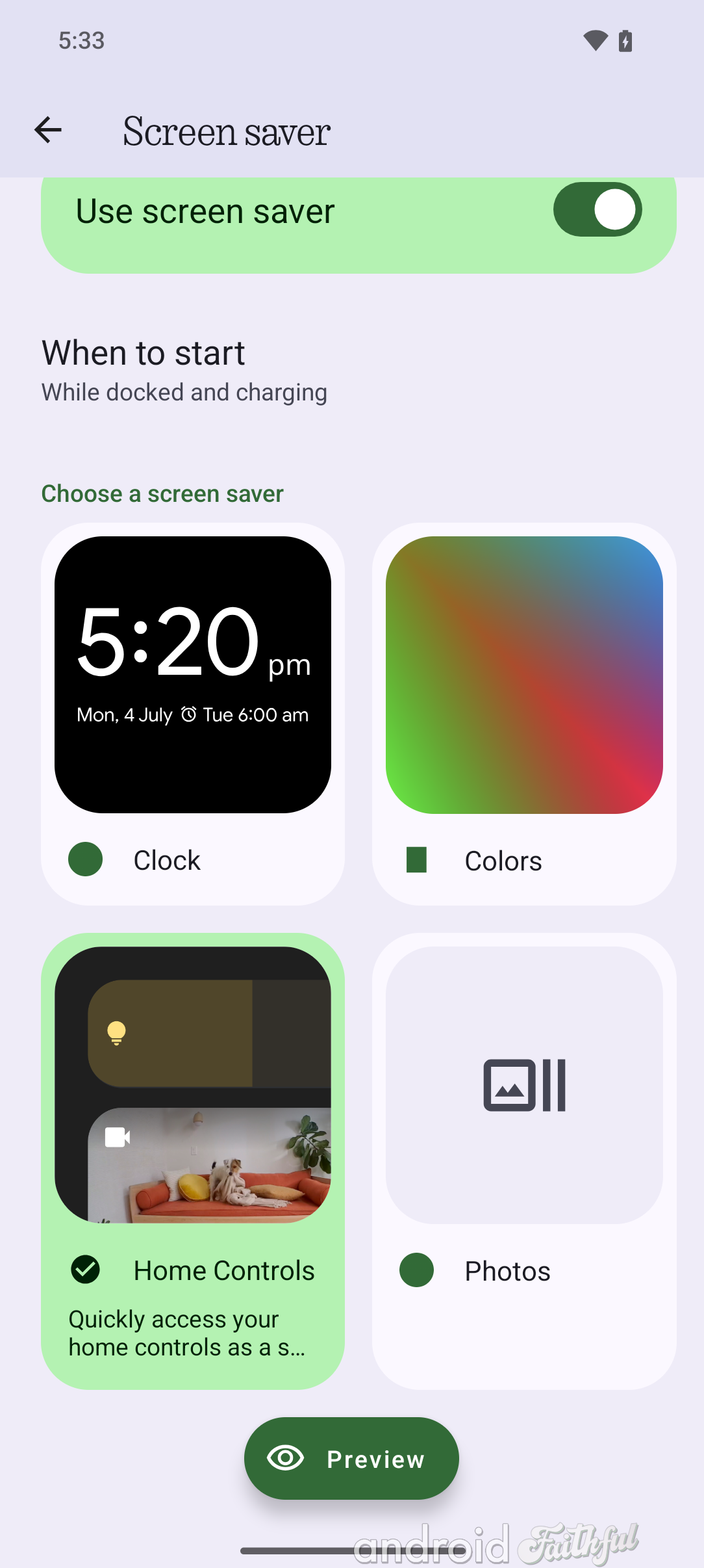
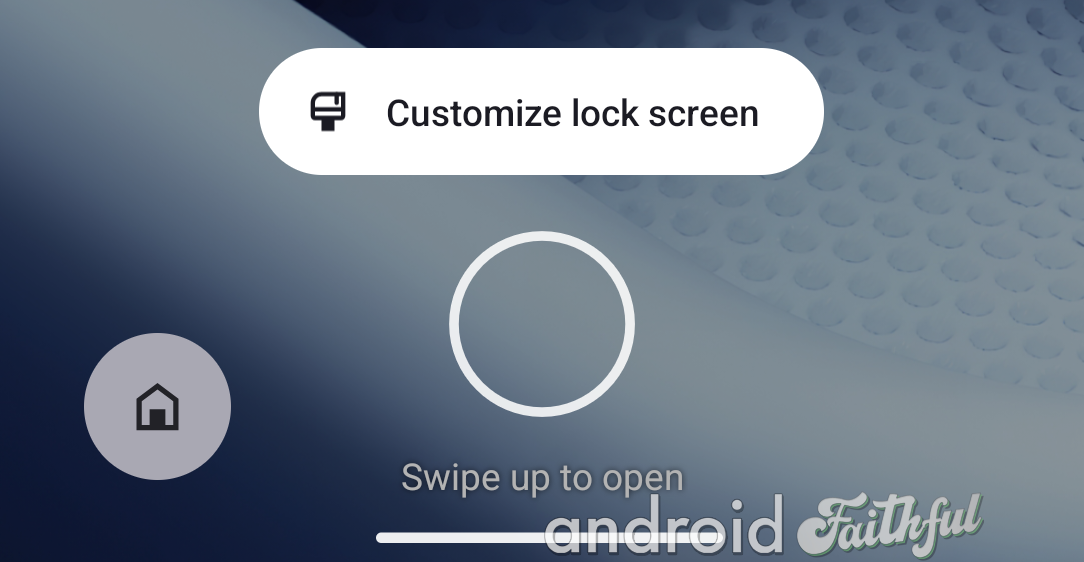
Nothing OS 3.0 is based on Android 15, which means it inherits a couple of features Google added to AOSP. These include:
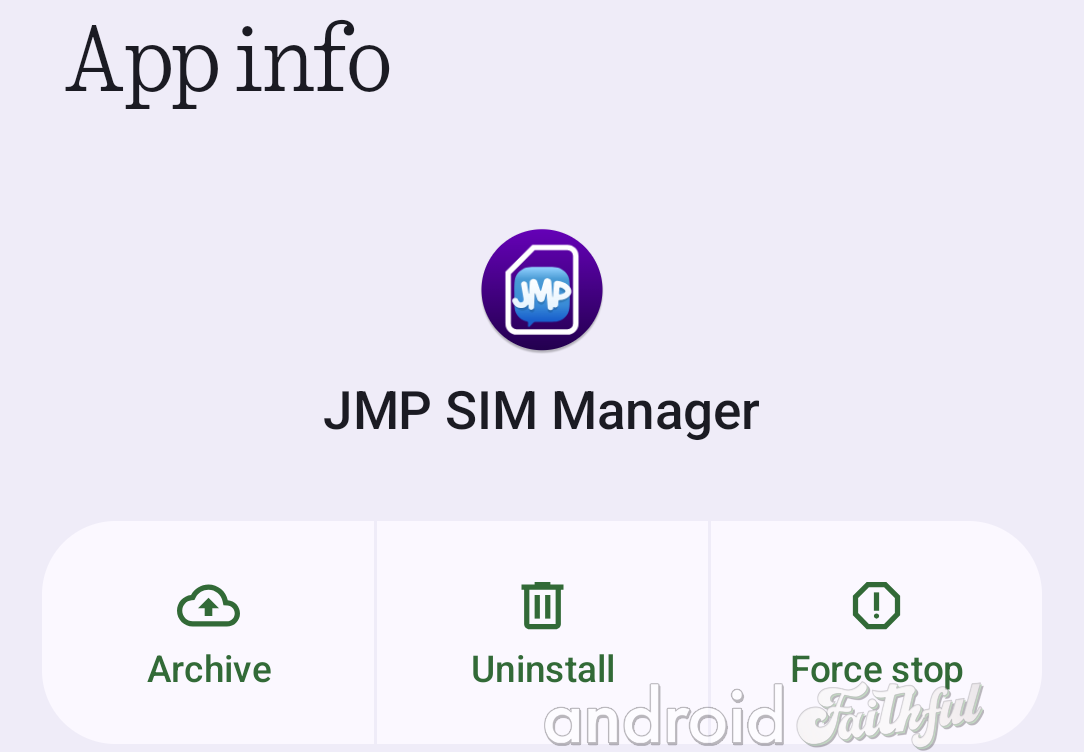
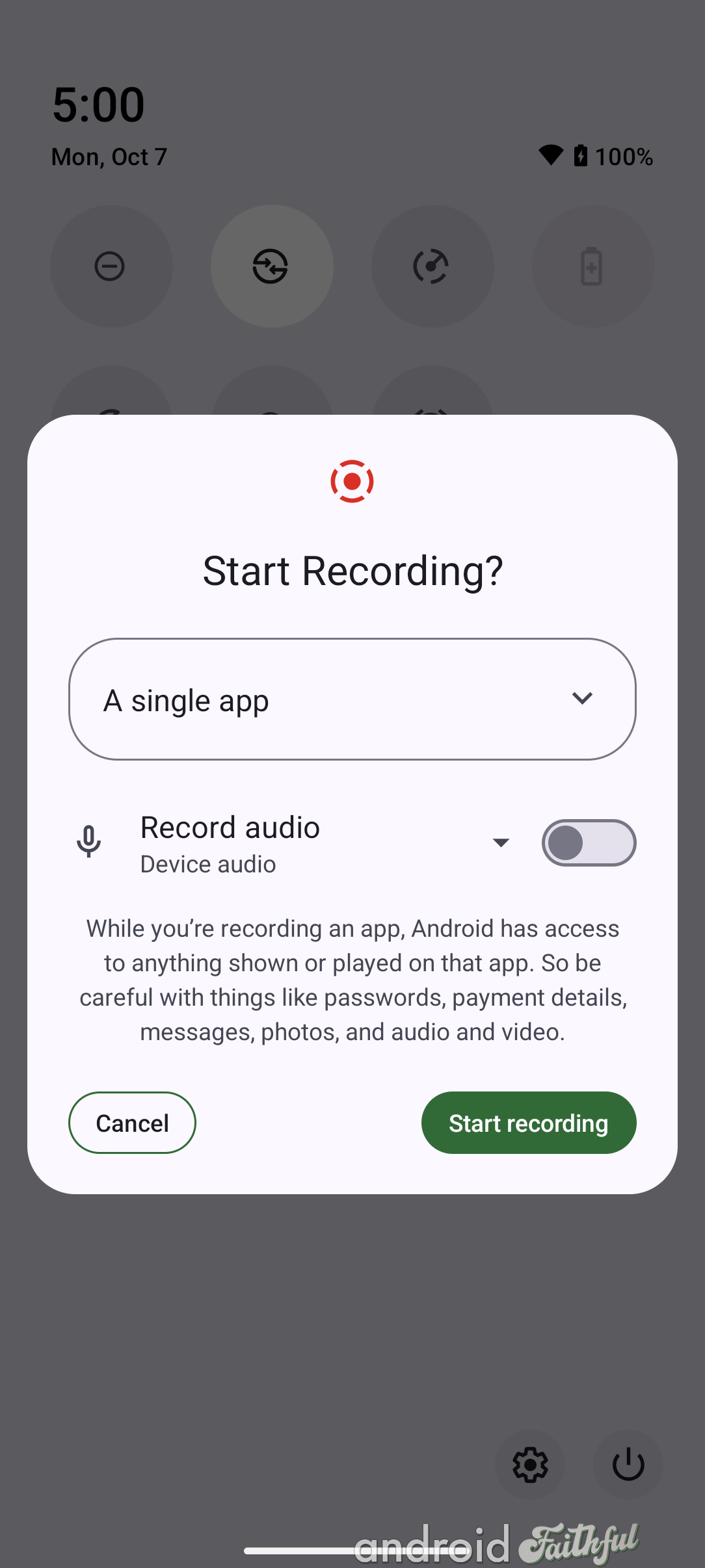
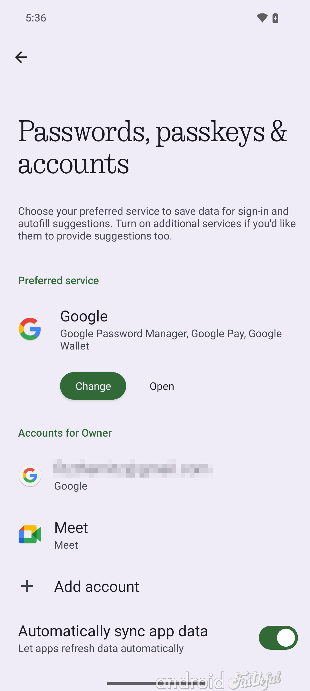
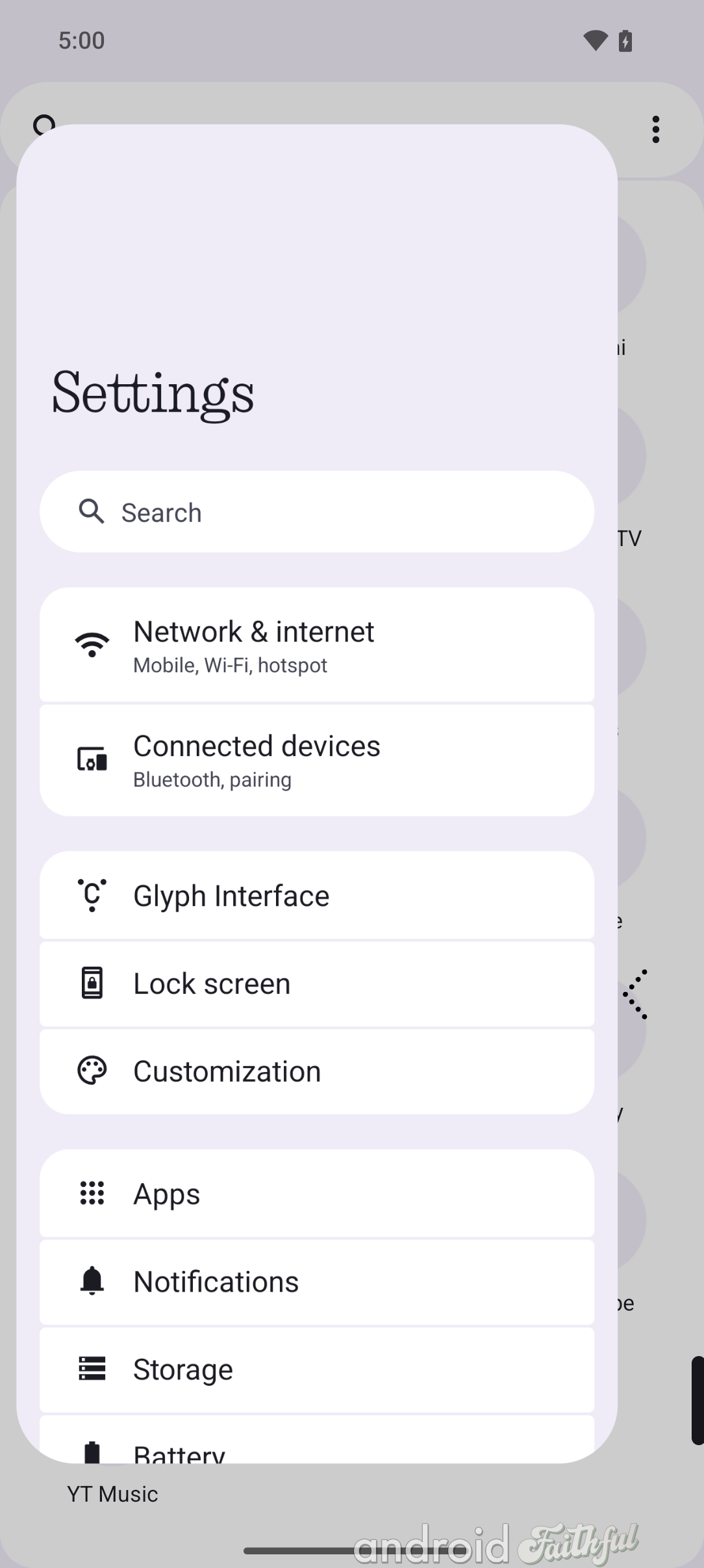
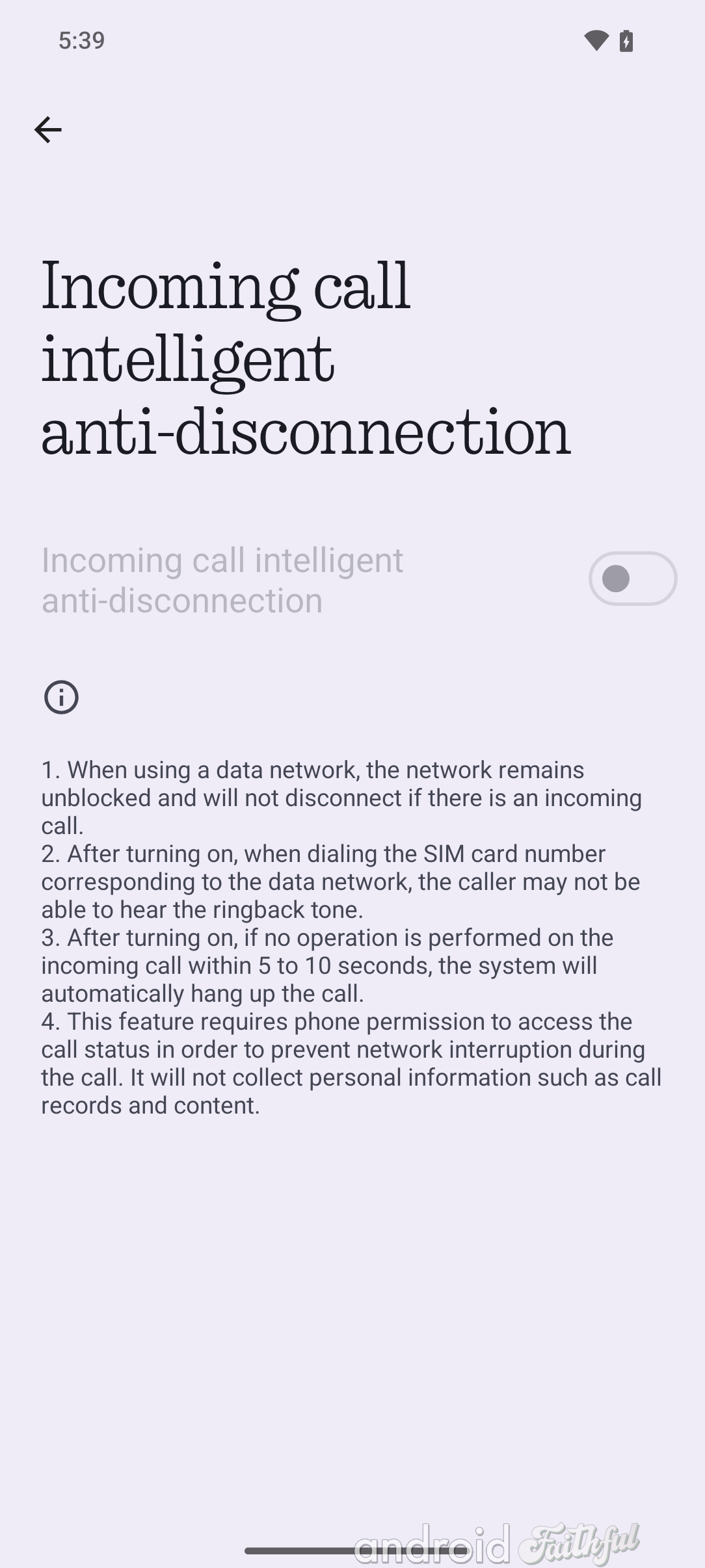
Nothing OS 3.0 also brings a few smaller changes. These include:
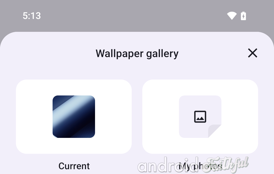
That's everything we've found so far from the few hours we've had access to Nothing OS 3.0. This is only the first public beta, so there are bound to be additional new features and changes in subsequent betas. We'll keep an eye out to see if Nothing adds any more features in future betas.